Google+

Wednesday, October 27, 2010

Beware Earth: Galactus Inbound!

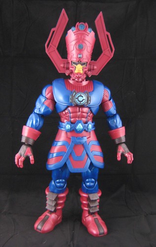
From the small scale figures of JLU, I'm moving on tonight to something right on the other end - that being the Marvel Universe Galactus figure from Hasbro, which is currently consuming the universe that is my toy display room!

This is the SDCC Exclusive version, not the current release that comes with Silver Surfer, and it has quite a story to its purchase and arrival before I even get to looking at the figure!

I was quite happy to wait for the eventual retail release of this and work out how to get it to Oz, but then I saw one of the SDCC versions unnoticed and unloved on eBay with very reasonable international shipping, and I certainly wasn't about to displease the devourer of worlds by allowing him to go unsold! I was pretty happy with my find, but it was too early to celebrate. The seller contacted me a few days later to say he wasn't sure he could get the large box the exclusive came in through the post due to its height, but would try to work it out. I have to give full credit to this fantastic seller - he really tried hard to make it work and stick to the price he had quoted. In the end Galactus made his way to our shores with the SDCC box wrapped in layers of gift paper to try to keep it safe but keep the box within the size that could be posted. A stellar effort!

As for the figure itself - it's one thing to know a toy is going to be big, and another to really appreciate it! He's a 19" figure that comes in a packaging that is the same as the regular MU figures, just proportionally bigger (read: huge!! - have a look in the Facebook album for photos and comparisons). On one level, I really regretted having to open him up, but this definitely isn't the kind of figure that you buy an extra of to keep one carded!

This is a really fun thing to own, but it's also an amazing piece. The level of detail on Galactus' costume is just unbelievable. There's very intricate sculpting here, lots of edges and ridges. His headdress is amazing and suitably impressive in size. The only thing I'm not totally grabbed by here is how much of his face is covered by his mask. I'm used to seeing a bit more of his cheeks etc - the amount covered here makes his face look a little disproportionately small in relation to his head.

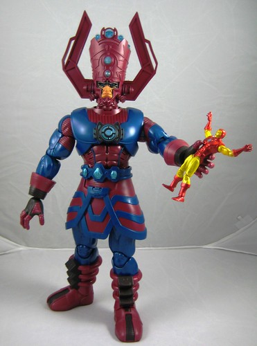
Despite the size of the overall figure, articulation hasn't been compromised. Galactus balances well and can be put in quite a number of standing and action poses. All joints move freely but aren't loose, making it easy for him to hold poses like grasping a smaller figure, etc.

I haven't put in batteries yet to try the light up features. AFB and family are moving in December and I'll probably wait until that is done. It looks like I need to move his shoulder harness to put them in. It'll be fun, but not what I bought him for so I'm happy to be patient.

The only shame here is that at the moment I've had to put Galactus on a shelf with larger statues as I don't have the space to put my Marvel Universe figures with him. I guess that means that once we relocate I need a bit more display space, right? Bring it on, and some similarly scaled MU figures to complement the assortment certainly wouldn't go astray either!

You can see more pics at Facebook, discuss this at the AFB Forum, and comment on this post to enter the October AFB Comment of the Month Contest - with an extra chance this month for an AFB Facebook fan!

Until next time!

Monday, October 25, 2010

A JLU find in Oz!

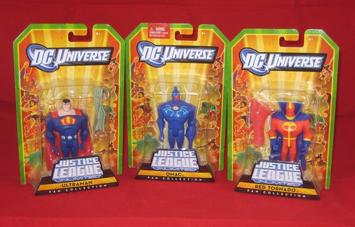
This probably doesn't seem like a big deal to AFB readers Stateside, but actually being able to find and buy action figures at retail has become such a novelty here I had to post about it. After a tip-off from AFB Forum member NiteOwl, I made a detour from my normal Sunday shopping to check out my local Kmart, which is in a mall I've been avoiding as it's a construction nightmare at the moment. It's also been so long since my once common toy-run through all the possible shops netted anything, I've really fallen out of the habit.

Happily, my trip was not in vain - just as NiteOwl had found in his local Kmart, mine had the latest (or one of the latest) wave of Justice League Unlimited singles: OMAC, Ultraman and a show-accurate Red Tornado, which I bought, and Captain Atom and Red / Blue Superman, which I left on the pegs for another happy hunter.

JLU is a line I have tried to quit at least half a dozen times, primarily because of the lack of a local release here for some time. Things like the Mattycollector exclusive packs and characters like General Eiling and Amanda Waller have kept me hooked, however, and I'm looking forward to the Mattycollector JLU Parademons coming up shortly, so I was keen to have new characters to line (for me) OMAC and Ultraman, and a Red Tornado that looks more like the unique look he has on the show. Plus, I really can't underplay the chance to actually buy a toy a retail as a factor in deciding to buy!

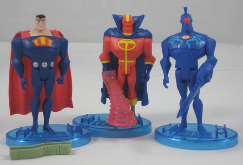
There's nothing groundbreaking about any of these figures - the standard JLU buck is used in all three, but OMAC has some extra sculpting for his fin-head, and he also has an arm attachment that connects to his left arm in much the same way the the Metal Men extension pieces snap on in DCUC, although not quite as snug. Ultraman has a disc-y sort of belt sculpted on, and similar discs on his forearms, which are a bit lost as they're placed at the back. Ultraman also comes with the standard strong-person bent piece of steel, which he can't possibly grasp, so that's a bit of a fail. Paint is great on all three, but I was glad a had a choice for Red Tornado as the one I got was the only one that didn't have a paint blip on his chest emblem.

Taking these out of the package, I was reminded of the other reason I've been tempted to quit this line, and the reason I don't currently have JLU on display: these little guys are such a bugger to stand up! The Mattel JLU bases are also way too big to display a wide number of them. That's not news though, and I guess most collectors have found their ways around it by this point!

Again, not necessarily post-worthy on their own, but these make news for me simply because they actually hit the shelves here - so here's hoping it's the start of a trend!

You can discuss this at the AFB Forum and comment on this post to enter the October AFB Comment of the Month Contest - with an extra prize for an AFB Facebook fan this month!

Until next time!

Sunday, October 24, 2010

A Great Pair of X-Villain Busts from Bowen Designs

Carrying on with the trend of pairs of items, I'm looking tonight at two of the most recent mini-busts from Bowen Designs: Pyro and Arcade.

These two X-Men Villains are the kinds of characters that I've come to really appreciate Bowen for making. To me, they're important X-Men villains, but in the scheme of things they're probably not significant enough to be the focus of that many collectables. Randy Bowen and co. certainly know their Marvel Universe, and they've been doing a fantastic job of covering it throughout the life of their Marvel licence.

Pyro is immediately a visually impressive bust due to the arc of flames shooting above his head, but that's not his only attribute - it's an excellent bust in all respects. There's alot of excellent sculpting here, from his flowing hair to his flame-thrower backpack to the flames in the arc and also the section between his torso and the base. The flames are slightly translucent and made of a light but sturdy material.

There are a number of colours here on the yellow / orange / red spectrum. but the paint work is excellent and the finish isn't at all garish. I've mentioned before that I really like the mixing of different materials in these pieces, and the tubing attached to Pyro's flamethrowers are a big win in this category.

This is a very tall bust due to the height of Pyro's flames - you can see a comparison pic in the Facebook album linked at the bottom of this post. This makes it quite a standout amongst all of the Bowen busts. It's all one piece too - no assembly required, so expect a big box. It really is an impressive piece, and it's getting a revisit in terms of a First Appearance Variant which is being done as an exclusive to the Statuemarvels website - worth checking out! (You must be a registered member of Statuemarvels to order).

Arcade is one of those kinds of characters that I've come to really appreciate Bowen for making. He's a iconic X-Men villain, but as a plain-clothed non-powered sort he's unlikely to be the focus of many collectables. Randy Bowen and co. certainly know their Marvel Universe, and they've been doing a fantastic job of covering it.

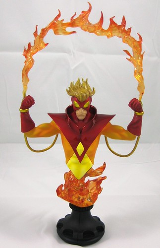
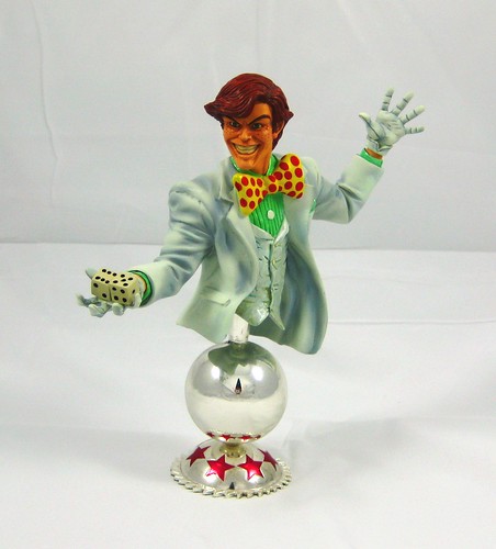
The design concept here is sound, and there are some nice touches, like the flow of his open jacket, the ribbing on his shirt, and the dice he's holding in his outstretched hand. There was something bugging me about the head on this piece, however, and when I did some searching of classic Arcade pics I saw what it was - he was drawn with a fuller face, slightly longer hair and no freckles. This version certainly looks and works well, and I'd imagine it must have a comic base somewhere as I know Bowen does a lot of work on source pics etc, but it doesn't scream classic Arcade to me.

Headsculpt aside, there's a couple of issues with this bust that take a bit of the shine off of the pleasure of getting such an oddball character choice. The first is an issue that is going to crop up when I post about the Modern Emma Frost Statue, and that is the "white" isn't really white. There's an almost bluish wash over it, and with so many other colours already at play with his tie and shirt, it's a tad hectic.

The second niggle is the red stars on the base. Going back to the promo shots now I see the clearly, but I never noticed them until I had the bust in hand. There's just so much happening colour-wise already with this piece that I don't think they were necessary, and they seem to fight with everything else that's happening here.

All up, I guess we have one my favourite and one of my least favourite Bowen busts in the same review. Shame about Arcade, but he's definitely a character I'm more than happy to have in my collection, but Pyro more than makes up for any disappointment.

You can see more pics (and pics of all of my Bowen busts) at Facebook, discuss this at the AFB Forum, and comment on this post to enter the October AFB Comment of the Month Contest - with an extra prize for an AFB Facebook fan this month!

Until next time!

Sunday, October 17, 2010

Something Old and Something New from MOTUC

Matty's October Sale Day has just passed, and I'm finally getting around to reviewing items from July and August! Yipes! (Note to AFB: pick up the posting pace!)

I freely admit to not being the most educated Masters of the Universe Classics Collector. I was 13 or so when the original He-Man toys came out, and I had a handful of the original ones before "growing out" of such things. When I grew back "into" action figures a few years ago and eventually discovered MOTUC, I started collecting them because of a nostalgic interest in the line and because they were so well done, but for every character that I remember either owning or seeing from the classic line, there's others that are a complete mystery, which is part of the fun of the line.

The pair I'm looking at tonight are one of each. On the classic side, we have Whiplash, a character I knew of from earlier years but certainly never owned. On the new side, we have Count Marzo - a fellow I've never seen before and from what I understand, has never appeared in plastic before.

Count Marzo doesn't mean anything to me as a character, but as an action figure he brings a number of new stylings to the MOTUC line. His longer hair, goatee and flowing cape / shoulder harness are very nicely sculpted. This combines with his colour scheme, which has been well applied here, to make a very visually striking figure. He has a pretty standard sword and a gem as accessories.

This is a "200x" MOTUC styled Character, the kind of which it seems we can expect to see less of since Mattel has made it clear that that look is "retired", one of the reasons we won't be seeing alternate heads in the future. Personally I think this it's a shame to make what is surely to be an iconic line for years to come a more inclusive one for fans of all eras. Without knowing the characters particularly well, I can certainly tell this figure has a bit of a different styling, but it certainly doesn't bother me, and it seems a bit of a lost opportunity. I am sure that more knowledgeable MOTU fans will have stronger opinions one way or another on this.

Whiplash is a character that really brings something extra to the standard MOTUC buck in the form of his large and groovy tail. This comes unattached in the pack and has to be snapped on to his back - a process I didn't find terribly easy, although I'm not the most adept assembler of small and fiddly things. Once snapped on properly, it's a really impressive piece with it's own movement for different poses, and it's very well sculpted.

This pretty major inclusion hasn't stopped Mattel from adding two pretty impressive accessories. He has a staff and a multiple sword / slicey thing which are both great and lend to a number of possibilities for fighting poses. Very impressive indeed.

I was expecting to like Whiplash's 200x head better, as the original head with it's bushy-looking eyebrows which seemed in photos to be more dated, but it's the original head that's ended up going on display. Partly it's because the 200x head lacks a bit of a clear and distinctive look due to the colours used, and partly it's because that whacky classic Whiplash head just looks darn fun!

You can see more pics at Facebook, discuss this at the AFB Forum, and comment on this post to enter the October AFB Comment of the Month Contest - with an extra price for an AFB Facebook fan this month!

Until next time!

Friday, October 15, 2010

Kotobukiya Rises with the Fall of the Hulks

The theme of my last few posts seems to be two statues from the same series, so why not two statues that are actually a set?

I'm not particularly enamored with modern mainstream comics at the moment, but one property that has really captured my interest in recent times is what's been happening in the Hulk corner of the Marvel Universe. That's really saying something for me, since my only interest in Hulk previous was his founding role in my favourite non-team, The Defenders. However, the momentum that started with Planet Hulk and has kept strong through the Red Hulk / Red She-Hulk sagas has really drawn me in and kept me coming back.

As such, I knew as soon as I saw the previews for Kotobukiya's Fall of the Hulks Fine Art Statue Set, with one Hulk each of the Green and Red varieties, that I would end up owning them. The pieces are great on their own, but as a complimentary set they just couldn't be passed by. Thankfully Father's Day (first Sunday in September here in Oz) was coming up, so I asked for something red and something green, and thankfully I didn't end up with apples!

These statues are just plain amazing, and not just because of their size. They are incredibly well sculpted for starters and capture the characters brilliantly - from beautifully detailed musculature to rippled and ripped fabric to great headsculpts which capture the characters fantastically, these have been set up to be perfect.

Green Hulk gets a perfect score for me. A fantastically dynamic pose is uses here and it works well on its own as well as in the set - he looks absolutely stunning facing front-on but looks great from the side as well. The headsculpt is brilliant - truly classic Hulk. His muscle definition is well sculpted. This is all supported by an excellent paint job - the green used on his skin gives quite a sense of depth and tone, while a light wash over his purple trousers provides a feeling of texture. This is just an amazing statue. A must for any serious Bruce Banner fan!

Red Hulk comes with an added feature: two swappable heads, once featuring an angry face and the other a wicked smile. It's the evil smile face that's on display at my place. Really, I think it was this headsculpt that sold me on the whole set because it really captures Rulk perfectly. Again, this statue looks great from front and side angles and would display well on it's own. While I'm extremely happy with this piece, there are a couple of factors that keep me from ranking it quite as highly as its Green counterpart. The sculpting on this piece is as equally well done, but the paint isn't quite as perfect - a wash has been used on the red paint of Rulk's skin that makes it look a little grotty, and the red paint on both heads is a tad darker than the skin. Neither are deal breakers but they are things I'd look to improve if I could.

These are truly massive pieces and incredibly heavy to boot - make sure you check the maximum load bearing of any shelf you plan to display the two of them on together! Thankfully they're designed to face each other in battle pose as they'd be too broad to fit in my display facing the front. Too hefty for pegs or pins, these have quite large blocks on the bottom of the feet which slot into holes in the base and they both stand very steadily.

I haven't bought into Koto's Fine Art Statue line overall, as some of the headsculpts are bit lacking and they haven't yet moved much beyond the top tier characters, but some of their upcoming Danger Room statues potentially look appealing. For larger statues like these, however, they are far more economical than their competitors, especially when international shipping is involved! I also think these two statues stand up very well against Hulk product from other producers. They certainly stand up extremely well in my collection!!

You can see more pics at Facebook, discuss this at the AFB Forum, and comment on this post to enter the October AFB Comment of the Month Contest, with the added bonus of an AFB Facebook Fan winning an extra prize this month!

Until next time!

Tuesday, October 12, 2010

More Marvel Bishoujo Glory!

Another pair of statues from the same series to look at, but from last night's grayscale style post, we move on to some of the most colourful things out there, tonight we're looking at the latest two releases from Kotobukiya's Marvel Bishoujo Statue line: Psylocke and Phoenix (regular version).

Psylocke is a popular character for collectables at the moment. Kotobukiya is also producing a Danger Room Fine Art Statue of her, Bowen Designs has just released a Full Sized Statue, and Sideshow has a Comiquette coming out before the end of the year as well. It's not hard to see why: as well as being a popular character, she's pretty easy on the eye!

The Bishoujo version of Psylocke makes the most of this and places her in a rather... striking pose. The colours in this series are very bright, and the non-muted versions of Psylocke's purple hair and blue outfit work here, but only just. Betsy is sometimes shown with matching leg straps on each leg, while they are also often shown as different from the left to the right. Koto has gone with the symmetrical version here, which I think is best for a small piece like this. Psylocke comes with removable accessories -her two swords. These are interchangeable and easy to insert but need to be placed at the correct angle so as not to block too much of her face. A very nice touch to top off a very nice piece.

One niggle is that the "X" base that Psylocke is placed on actually takes up quite a bit of room. I for one collect way too much to have pieces spaced out too far in my displays, so when space is a premium, an overly broad base is a nuisance, but I realise that's just me, and it doesn't take away from my appreciation of this lovely piece.

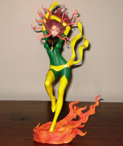
I haven't seen Phoenix in Australia as yet and I'm not sure if she's made it to our shores at present: I actually picked up this one up on a recent visit to Singapore when I happened upon a little piece of toy heaven called China Square Central - a small centre in Chinatown that is a must if you ever make it to that wonderful country!

This is one classy piece. Phoenix goes straight to the head of the Bishoujo class for me alongside the Scarlet Witch piece I've reviewed previously. The silhouette of this statue is incredibly striking. One thing I quite like about these PVC statues is the juxtaposition of soft and hard plastic, and this is put to outstanding use here. The sculpt work on this piece really is exquisite and it's supported by an excellent paint job.

The pieces I seem to like best in this series happen to be those that have the most intuitive bases. Scarlet Witch's cape was perfection, and Phoenix's base of flames is almost an equal winner. The best part of this piece for me, however, is Phoenix's hair. It's separated into many strands with a few shades which frame her face beautifully and add a great deal to the overall flame effect of the statue. This one is definitely a keeper!

Koto is soon to launch a DC Bishoujo line, and while I like the scale of the Bishoujo statues better than DC Direct's similar Ame-Comi, the price of the Bishoujo pieces and the difficulty of accessing them here in Oz means that I'm more likely to stick with the Ame-Comi line than take on double the pain in trying to collect two Koto lines. Time will tell according to character selection and style on both sides, I suppose.

You can see more pics of all of my Marvel Bishoujo Pieces at Facebook, discuss this at the AFB Forum and comment on this post to enter the October AFB Comment of the Month Contest! Remember, there is an extra chance for an AFB Facebook fan to win a prize this month!

Until next time!

Monday, October 11, 2010

Beauty in Black and White

I am not a completist collector of DC Direct's Batman Black & White Statue line, but there have been the occasional pieces that have caught my eye, and two of these have been released relatively recently: the Steve Rude Catwoman and Frank Quietly Batman statues.

The Steve Rude Catwoman statue captures my favourite Catwoman look. I doubt she'll be taken out of her leather gear anytime soon, and it's a look I've grown used to, but this cape and skirt combo is much more iconic Catwoman to me and it's great to see it captured here. Better yet, this is a fantastically dynamic pose - the raised arm, wide stance and flowing skirt and cape must have been a sculptor's delight, and it's been very well executed with a suitably fierce facial expression to match.

I am quite fascinated by the incorporation of softer materials within a sculpt, and the whip here is nicely done. Firmly held in place and shape, but not easily breakable. It's a great accent for a near-perfect piece.

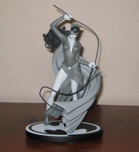
I'm aware that Frank Quietly's Batman design isn't everyone's cup of tea, but I am very fond of it, and this statue captures the look brilliantly. There are a number of things I like about Quietly's Batman: the wrinkles in the boots and briefs, the understated, straight-hanging cape, and the fact that his Bats isn't an overly muscled goon. One of the things that makes Batman who he is is the idea that he's a bit of an everyman who has become The Dark Knight - definitely superiorly fit and athletic, but not a massively steroided physique.

The best part of this statue, however, is the headsculpt. It captures Quitley's Batman perfectly. Quite often I find that there is a degree of subtletly or detail that fails to translate from sketches to some of DCD's busts and statues (particularly their artist specific bust lines), but the Batman Black & White line seems to be fairly consistent in nailing these exactly, and this is a perfect example of that.

These are statues I'm very happy to have amongst my Batman display. The smallish size of this line makes it an easy one to cherry pick as they don't have huge bases and can easily be placed on a smaller action figure shelf as well as a larger statue shelf. I'm waiting for a more classic version of the Joker to compliment these than the one that's already been released, and a Silver / Bronze Age Robin certainly wouldn't go astray as well!

You can see more pics at Facebook, discuss this at the AFB Forum, and comment on this post to enter the October AFB Comment of the Month Contest - and remember it's my birthday this month so one AFB Facebook fan will also get a prize this month!

Until next time!

Friday, October 01, 2010

AFB Sees Stars in a Special Birthday Month - October Comment Contest!

First off, thanks to everyone who commented on last month’s blog posts. Congratulations to evilwilma for being our randomly selected winner! Once we hear from Wilma, his choice of either the Marvel Universe Thanos figure or one of the Venture Bros Retro Style figures will be on the way when available from Mike’s Comics N’ Stuff.

Now to October’s Contest, and it's a bit special, as AFB (the guy, not the blog) is turning 40 this month, and I intend to party to celebrate!: On offer are two great prizes, either the Ted Knight Starman or Jack Knight Starman figures from DC Universe Classics Wave 15. This month, as well as one comment from an October blog post being selected for a prize, one AFB Facebook Fan will also receive an October prize, so if you're not a fan of AFB on Facebook, become one now!

A few bits and pieces:

  • every genuine comment on a post from the calendar month will be eligible for receiving the prize. I’m going to stick to my own time zone and call it at 23:59:59 Australian Eastern Standard Time – best to comment often and comment early!

  • if my super scientific randomizer comment selector system chooses an Anonymous comment, I’ll skip it and go again – you need to leave a name, a link, your AFB Forum username or email addy so that I can contact you if you are the winner. Blogger comments allows you to do this, as long as your profile is not set to private – check your settings.

  • you will be given a choice of one of the two figures on offer from the month’s contest – figures will be in their original packaging.
  • figures will be sent by first class mail within the US (Mike is sending them, remember) and first class international to any overseas winner. An overseas winner can elect to chip in for Priority Mail or Insurance, but otherwise we can’t take any responsibility for a parcel that doesn’t arrive – after all this is coming out of AFB’s not dreadfully deep pockets!

Once again, thanks to Mike for making this all possible for us, and here’s to another happy month of commenting, and a very happy 40th to me!

Until next time!

Related Posts Plugin for WordPress, Blogger...