Google+

Monday, October 31, 2011

AFB Custom Spotlight: DangerDrVenture perfects Professor Pyg!

It's been awhile since we had a Custom Spotlight feature here at AFB, but it has nothing to do with a lack of great customs appearing at the AFB Forum - there are a fantastic group of customisers hard at work there! Happily, the Custom Spotlight for tonight is a truly spectacular effort!


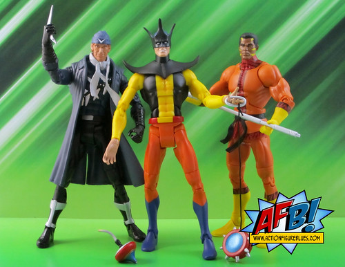
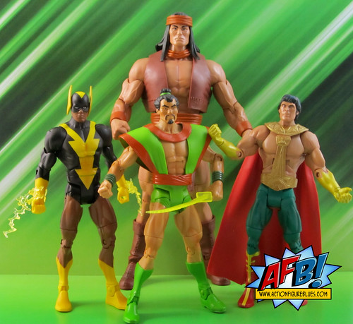
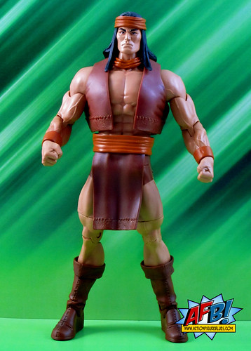
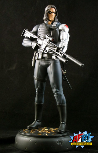
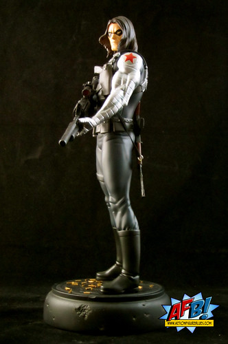
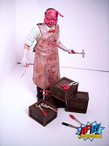
DangerDrVenture is a very well-known customiser who has some of the best skills I've ever come across, and we're very fortunate to have him sharing his work at the AFB Forum. You'd be hard pressed to tell DDV's efforts apart from most commercial efforts. His sculpting and paint work are both exquisite. When I saw his amazing effort on the newest addition to Batman's extensive rogues gallery, the Grant Morrison creation Professor Pyg, I knew it was something that needed to be shared with the AFB audience.


DangerDrVenture was kind enough to provide us with some pics and an interview to go along with his fantastic creation:


Q: How did you begin customising action figures?

A: I think my first custom figure consisted of some He-Man insect toy legs glued onto one of those fly toys from Insectoids(remember those?). It was a 'Ninja Turtles Mutant Fly' custom. That was probably in my 3rd grade year. My parents let me use a hot glue gun at 7 years old!


Q: What inspired you to customise this particular character?

A: I love Morrison's Batman, and I've been collecting the recent DC Direct 4-figure waves from Batman Reborn, Batman Inc, etc. I felt those waves were lacking in some key characters, so I made up my own custom wave. I LOVE Pyg because he honestly disgusts me. He's irredeemable and reprehensible. An absolute TRUE villain, in a world of softy anti-hero bad guys. He's influenced by Dr. Harry Harlow's ape isolation experiments. If you haven't heard of him, you should check it out. Disturbing stuff.

Q: What parts and processes did you use?

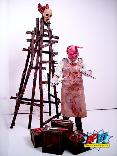
A: The base figure is a DC Direct Perry White figure from that old Silver Age Superman line. I took the apron from a Medicom Hostel toy, and the mask is sculpted. I had to sand a big pouch of tools from the apron to make it character-accurate. The intention was to make him look frightening and faithful to his printed counterpart. I honestly think Frazier Irving's depictions of him are still way more frightening than I was able to capture in this figure. The 'mommy' is just hobby sticks and tooth pics with a sculpted mask on top.

Q: Did everything go to plan or did you have to make changes along the way?

A: The sticks from his 'mommy' went to plan. I actually sketched it out first, so those sticks aren't just randomly glued together. I made Pyg up as I went along. He originally had really detailed grasping hands from a Neca Jigsaw figure, but I found a set of doll tools at a hobby store, so I opted to give him hands that could hold them. I think the ears broke off 14 times.

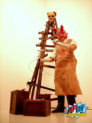
Q: How do you feel about the finished product?

A: I'm about 50% happy with it. I think i could have done a better job on the mask's sculpt (the expression looks too human). I plan to make another in his 'pimp suit' from Batman and Robin. I'm more proud of the 'mommy' than anything. It took hours to glue those sticks.

Q: What’s next on your custom table?

A: Finishing commissions! I got behind these last few months. As soon as I get some free time, I plan to augment a few of my Mattel DC teams now that we know what Mattel is releasing in the club. I still need a good functional Elongated Man.


-----


Many thanks to DangerDrVenture for bring back our Custom Spotlight feature with a very impressive bang! Custom Spotlight will be back next month with the winner of our current AFB Custom Competition, "Kirby Your Enthusiasm!". It's going to be a good one!


You can see DDV's custom thread at the AFB Forum and discuss this here, or comment here to enter the October AFB Comment of the Month Contest!


Until next time!


Saturday, October 29, 2011

Bowen belts out a superb Banshee!

For some reason, my favourite characters in team books are rarely the A-listers. I always seem to gravitate to a less popular, but to me at least, more interesting supporting character. (This is probably not a surprise coming from a guy whose all-time favourite character is Aquaman!). Tonight’s review is a perfect example of that trend in my choosing of beloved characters!


Tonight I’m having a look at one of the latest releases from Bowen Designs: the Banshee Full Sized Statue. I first discovered Banshee in the pages of the original Official Marvel Universe Handbook of the Dead and Inactive (February 1984), and then started reading his X-adventures shortly after when a huge box of older Marvel Comics came into my possession. I liked Sean because he was never quite defined by being an X-Man in the way most other characters were - his life and world were always bigger than just the X! Since the initial loss of powers that ended his X-career, he’s had quite a history, with a second wind as an X-Man and instructor, a totally pointless death and then a resurrection of sorts. What became of him at the end of Necrosha still isn’t clear to me - such is the lot of heroes on the C-list!


We certainly haven’t been inundated with Banshee collectibles over the years, but he has managed the odd action figure here or there, and a Bowen Mini-Bust a few years ago. Randy Bowen himself was the sculptor back when Banshee got the mini-bust treatment. This time around it’s the turn of digital sculptor Jason Smith. There is still debate about whether or not digital sculpting is as good as the traditional method, but if you ask me, this piece puts that sculpt to bed. This is an incredibly detailed headsculpt which captures Banshee in full sonic scream just beautifully. Smith has truly nailed our favourite Irish mutant from head to toe.


While Banshee is the main event here, the base for this statue is particularly spectacular. Banshee is shown launching himself from the battered hand of a Sentinel. This gives the statue quite a bit of extra height compared to an average Bowen piece - Banshee clocks in at just over 16” tall. The pose looks precarious, but the rod that inserts into the Sentinel base is quite long, making the attachment pretty secure. Due to the height and relatively slender nature of this piece, I wouldn’t put it to the kind of toppling test that AFB’s Destructo-Kitty has been known to provide, but it isn’t going to fall over from a simple bump.


The use of the Sentinel base is a very clever move by Bowen. On a practical level, it provides a way to show Banshee using his powers to achieve flight - since sound waves are invisble he can’t be elevated by a construct like flame or ice. On a business-sense level, incorporating the very popular Sentinels with a lower-tier X-Man most likely aided the sale of this piece to collectors who may have been on the fence. Whatever the reason, the effect is incredibly impressive.


I really like the pose of this statue. I’ve read some comment about the angle that  Banshee launches out at not being straight on - he in fact leans to the right a bit - more noticeable from the back (click here to see a photo of this on Facebook). While it doesn’t look quite as I was expecting, I don’t mind it at all. The sculpt of Banshee himself is really fantastic. I’ve always felt that Sean was actually a very powerful mutant and this pose definitely captures that power. I like the fact that some of detail on his uniform is sculpted even when the colour is the same and they easily could have just been painted on - a nice touch .


I’ve mentioned the headsculpt already, but I need to come back to it just to say I think it’s one of the best Bowen has produced in some time. It’s a very crisp sculpt with a great deal of detail, and Smith has also made the open-mouthed pose, which can often come off incredibly cheesy - look very powerful. The detail in Banshee’s hair is also very impressive.


A nice side effect of the Sentinel base is that it makes Banshee fit very well with Kotobukiya’s X-Men Danger Room Series - of which I currently own Psylocke and Colossus. The Sentinel detail is slightly different, but the scale is spot on. I don’t tend to mix lines, but it’s really nice to see these compliment each other so well.


Bowen seems to be on quite a run of mutants at the moment, and it’s been very exciting to see some of the Classic X-Men that have only been made in bust form get the full-sized statue treatment. In this year alone we’ve enjoyed characters like Havok and Kitty Pryde, while characters like Polaris and Sunfire are on the way. A complete full-sized X-Men collection keeps becoming more of a reality! Considering that Banshee is right up there on my list of favourite mutants, I have no doubt that no matter what comes in the future, this statue is going to remain at the front of my display!


You can see more pics at Facebook, discuss this at the AFB Forum, and you can comment on this post to enter the October AFB Comment of the Month Contest!


Until next time!


Sunday, October 16, 2011

DCUC Wave 18: Or, what does it take for a '70s Interracial Sterotype to get a full costume around here?

It’s been quite a while since I had a chance to review a wave of Mattel’s DC Universe Classics line. This is mainly due to my decision to skip Wave 17, the Deputy Lanterns wave, and wait for Wave 18 to come around. I’ve had my photos of this wave done for awhile but have been distracted by other pieces and real life events, so I’m just now getting around to doing my review of DC Universe Wave 18.

In the same way that the Wave 17 line-up held no interest for me due to the “flash-in-the-pan” nature of the character designs, the choices for Wave 18 were controversial for some collectors. The majority of these characters originated in the Super Friends cartoon from the 1970’s, which is a touchy subject for some collectors who feel that these characters aren’t comics-based enough to justify a spot in a “Classics” line. I am in the other camp, as it was the Super Friends series that lit the flame of interest in the DC Universe that has lasted all of these years. These characters have a special place in my childhood memories, and so I am delighted to have the chance to own them in this form.

There are two characters in this wave who don’t match the Super Friends set, and I’ll start with those, as they represent the high point and the low point of the wave for me. Bronze Tiger is a fantastic addition to the DCUC line. I’m not sure how he managed to secure a spot in the series, but I’m very glad he did.

Bronze Tiger is rich with accessories and pack-ins. For starters, he has an additional head so that he can be displayed either in his classic Tiger Mask or, for Suicide Squad fans, his unmasked Ben Turner version. Both of these headsculpts are very well done – the tiger mask head is beautifully sculpted. In addition, Bronze Tiger comes with two weapons – a staff and a sword. He can hold both of these easily – not something that can be taken for granted with the DCUC figures. All of these factors combine to make Bronze Tiger the figure of the wave for me.

On the other end, Captain Boomerang represents one of the biggest missed opportunities of the line to date. A classic Digger Harkness would have complimented Bronze Tiger beautifully and added both to the classic gallery of Flash Rogues and the Suicide Squad collection. Instead, we’re given the Brightest Day Captain Boomerang, with a limited number of appearances and little relevance to anyone but Geoff Johns. Le sigh!

For what it is, this is a fine figure. The headsculpt is captures Digger’s Brightest Day look quite well, and his trenchcoat and scarf are very nicely sculpted. He comes with one boomerang accessory which isn’t very sturdy, in fact mine bent getting it out of the packaging, making Captain Boomerang a little less deadly. Here’s hoping that a classic version is still a possibility - it would make a great addition to the Club Infinite Earths Subscription!

Now on to the Super Friends related figures, and I have to say each one of these is a real treat. Toyman is my favourite of the bunch. This partly because the character has the longest comic book pedigree of the bunch, and partly because I really most aspect of this piece. His headsculpt is excellent and spot-on for the look that they were trying to capture. The one thing I would have like to have seen done differently would have been the use of a slightly thinner buck - perhaps Deadman style - Toyman was never this buff!

Toyman comes with some great accessories - a large spinning top which he can hold on a short flexible handle, and an oversized yo-yo with working string. I haven’t had much luck posing him with the yo-yo without the figure being on a stand, as its weight and his rather weak ankle joints combine to pull him over. I normally don’t like giving up display space for stands, but these accessories are worth it. A great touch!

Moving on to the second half of the assortment, we’re now looking at the set of characters that were created specifically by Hanna-Barbera for the Super Friends cartoon. Black Vulcan is a representation of what might have been had the powers that be been prepared to foot the bill for the use of Black Lightning in Super Friends. As well as being an established comic book character, Black Lightning had another big advantage on this guy - long pants. Black Vulcan actually had long pants at one point in the SF cartoon, but generally appeared in the black speedos we see him wearing in the DCUC version.

Fashion choices aside, this is a fine figure, but the headsculpt isn’t 100%. As well as having a really bland facial expression, the “wings” on the side of his head are on the large side - and let’s face it - the poor guy doesn’t need any help looking silly. The one thing I do really like about this figure is the lightning blasts that snap on to his wrist. Hasbro has made good use of these sort of constructs in its Marvel Universe line, and I’d love to see Mattel use more of these in the future.

Samurai is probably the best known of this particular group of characters, thanks to his rather inexplicable inclusion in Kenner’s Super Powers Toy line from back in my childhood. I have to admit, when I picked up this version, I was a tad disappointed that he didn’t have his “Power Action Gale Force Spin!”

This figure is a very faithful rendition of what all remember and either love or loathe about Samurai. His vest is nicely sculpted, with little creases to add detail. He also has a sword as an accessory. His headsculpt is very well done - the best of all of the Super Friends characters.

El Dorado may have had the least amount of screen time of this set of Super Friends characters, but at least he got pants. Of course, he had to give up his shirt to get them, but hey, them’s the breaks in the '70s token interracial superhero game. This particular character rates the lowest in my personal care factor stakes, but for what he is, he’s well done. His belt and harness is a separate piece with nice detail, and it’s clearly where most of the tooling went for this figure, since his gloves are just painted on.

The Collect and Connect figure for this wave is Apache Chief, the last of the Super Friends characters. While this uses the standard CnC buck, it has some nice custom elements that work to good effect. His headsculpt is excellent, and the sculpted stitching on his vest and loincloth is a very nice touch, and his boots are also very nicely detailed. This completes the Super Friends set, and hopefully has scratched this particular itch for Mattel so that we can move on to other groups of characters.

There aren’t many more waves of DCUC left to review before we move to different retail distribution and Club Infinite Earths. While these figures meet some sentimental needs for some collectors, we are still waiting for this line to fulfil its promise in terms of delivering the world of characters we’d hoped for. For me, the Super Friends characters aren’t what I had in mind when I imagined where the line would go. I’m going to enjoy these figures, but they don’t make the collection feel complete by any means. Here’s hoping!


You can see more pics at Facebook, discuss this at the AFB Forum, and you can comment on this post to enter the October AFB Comment of the Month Contest!


Until next time!


Thursday, October 13, 2011

Kotobukiya's Bishoujo Invisible Woman won't be fading into the background!

I’ve been a great fan of Kotobukiya’s Marvel Bishoujo Statue series, but they’ve thrown me lately with some scale issues. Their Marvel Bishoujo Invisible Woman Statue gets things somewhat back on track in the scale stakes, but I do have some other concerns with it which keep me from pronouncing that Koto is completely back on track with this series.


Sue Storm is a favourite character of mine, and a leading Marvel female that doesn’t get the amount of attention in the collectibles department that I feel she deserves. I was very happy to hear that she was to be released in the Bishoujo line, and the solicit photos of the piece gave me hope that it would be a success.


I like the way that the majority of Sue’s body and costume are sculpted, but I’m not wild about the pose for this piece. I understand the there is a cutesy element required for this genre, but the way in which Sue is holding a few strands of her hair just looks silly, and creates issues I’ll talk about in a moment with her head and hair. As I mentioned, the sculpt work itself is excellent - I especially like the detail on her uniform - the creases and wrinkles are all very nicely done.


The work that has been done to create the translucent elements of this piece are really outstanding. Sue’s hands and feet are starting to fade away, with the ends completely see-through. This is best seen on her left foot, with sections of the base visible behind it, and her right hand, which is placed on her hip and also completely translucent. Further, the ends of some strands of hair are also disappearing - also a great touch. Beyond the translucency, I really love the paint job on this statue. The metallic blue chosen for her uniform is quite stunning, and compliments the nice sculpt work on the body and uniform.


Scale-wise, this piece is certainly not a Ms Marvel-style giant, but it’s still not back to the original scale for this line, being more in scale with the slightly larger Black Cat than the earlier pieces. While I’d obviously have preferred that the line stay in a uniform scale, I’d much prefer pieces of this proportion than another Ms Marvel sized gargantuan-ess.


Invisible Woman has one of my favourite bases in the line to date. The monster hand and cracking force field create a diorama effect that has an impressive amount of detail compared to some of the plainer riser style bases we’ve seen before. I’d love to see more of this style of base as long as the additional pieces don’t get too big and dominate the figures.


Clearly, I like a great deal about this piece. Where it loses a bit of shine for me, however, is the headsculpt. There’s something just a tad off about the position of both the head on the neck and the hair on the head that creates a slightly odd look. I’d like to be able to slightly adjust the positioning of each, but of course this is a statue, not an action figure!


There is a variant version of this statue which was exclusive to SDCC which has Sue’s shorter hairstyle which removes some of these issues, but it also has a different, and for me much less preferred, version of the costume and no transparency. Perhaps, if I ever manage to come across one for a reasonable price, I might consider it if the positioning of the head is better than this version.


Despite this issue, I’m very glad to have the Invisible Woman in the Bishoujo collection, and she does look great standing alongside the other pieces in the line. I do hope that Kotobukiya can stabilise the scale issue in this line and at the very least keep things at these proportions for future releases - one of which I do hope will be Storm - I can’t believe we haven’t seen her yet in this line!


You can see more pics at Facebook, discuss this at the AFB Forum, and you can comment on this post to enter the October AFB Comment of the Month Contest!


Until next time!


Monday, October 10, 2011

And the Stay Puft Goes to....

I'm pleased to announce the winner of our "Sing a Song for Stay Puft!" Contest. We ended up a bit short entries but with no shortage of quality. 


After a vote by the Administrators of the AFB Forum, the winner is Freak Studio for this video entry:


Stay Puft will be making his way to Freak Studio's Argentinian abode shortly. We will also be rewarding a second prize of either a MOTUC Captain Glenn or a DCUC Swamp Thing to Nite Owl for this fun entry:


Congrats to the winners, and stay tuned for a new contest starting shortly!

Until next time!

Sunday, October 09, 2011

Masters of the Universe Classics gives AFB Crabs!

Well, crab singular...

I’m more behind than usual with my Masters of the Universe Classics reviews, so I’m going to do some short and sweet posts on single pieces instead of my usual pairs to try to catch up. Up tonight is Clawful, and he’s a very easy piece to write about because he’s great fun!

Prior to this release I had some vague knowledge of Clawful as a MOTU character, but I don’t know that I’ve ever seen the classic toy in person - he definitely came out after my brief childhood flirtation with the original line had ended. Thanks to good old Google Images, I’ve been able to have a look, and this new version is a fantastic update of the classic that had gone before.

Something that may not be noticeable at first glance with this figure is the detail that has gone in to the use of different textures on this figure. I particularly love the sculpting work that has gone in to his armor / vest. The ridges and textures that create the front and back panels of this are lovingly detailed, and supported by a great paint job for a very realistic and deep look. This is very nicely constructed action figure.

Underneath the armor, there is a bubble / scale pattern that covers Clawful’s upper chest and shoulders which is also used on his head and claws. His feet are also scaled with a slightly different pattern. All of this detail makes this a beautiful figure, and shows where the dollars go in a line is basically using the same buck time and again. I like the way that the Four Horseman have established Clawful as a mutated crab by extending the scaled area further down his body from the head as opposed to the original which looked more like a guy in a crab mask.

Speaking of Clawful’s claws, they are something to behold. His right claw is the large claw and it is articulated with a hinge, allowing Clawful to be able to hold objects. It’s a neater articulation than the original version, which had a large gap in the middle of the claw to allow it to open. The MOTUC version creates the opening claw effect without taking away from its aesthetics. It doesn’t stay open very well, but this means it closes fairly tightly on anything you want to place there. Clawful’s smaller left claw is also articulated, something that appears to be different from the original. This allows him to hold his green staff, which appears to have been held by a strap that slipped over the right claw. Clawful also has a fantastic shield which can attach to this wrist.

One thing I’ve read a bit of criticism about this figure is his eyes, which are very cartoonish with large whites, dark outlines and thick black eyebrows above. It’s a faithful reference to the original figure and I think it’s good fun. I can see where some might argue that it’s quite different from other characters in the line, but when you look back at the original line this was also the case. Something I think the Four Horseman have done exceptionally well in this line is update the classic figures by maintaining a truth to the spirit of the originals without being slavish to them, and I’d argue that Clawful’s cartoony eyes are a part of the spirit of the figure rather than just a detail. This was a good call in my book!

For someone who never had a full He-Man experience as a child (wait, that sounds wrong...), I continue to be amazed by how much this line draws me in. Clawful has definitely been one of the highlights of the 2011 MOTUC Subscription for this collector!

You can see more pics at Facebook, discuss this at the AFB Forum, and you can comment on this post to enter theOctober AFB Comment of the Month Contest!

Until next time!


Friday, October 07, 2011

Bowen's Winter Soldier is a Great Surprise Package!

Bucky Barnes may be on the losing side of the Marvel “Death of the Quarter” merry-go-round at the moment, but he’s been winning in the action figure and statue stakes in the last couple of years. I’m reviewing the latest, the Bowen Designs Winter Solider Statue, this evening.


After pulling the “Pre-Order” trigger at BigBadToyStore.com on this statue, I had a moment of uncertainty about the purchase, because close inspection of the preview pics made me a bit concerned about the headsculpt. I’m a bigger fan of Bucky’s shorter haired look in his Winter Solider guise, and this is a long haired version. I couldn’t tell if it was sculpt or shadow that made Bucky’s face look a bit too thin. In the end, I decided to leave the order and hope for the best as I really am a very big fan of Captain America’s one-time kid sidekick.


When I unpacked this statue, I was first relieved to see that my reservations about the headsculpt were unwarranted, and second stunned by how much detail on this statue I hadn’t noticed. This might seem like a simple piece, but it is actually quite complex in terms of both the level of detail and the concept. I wasn’t familiar with sculptor Khurram Alavi before this statue - but trust me, I am now. The man is a talent.


Bucky’s Winter Soldier gear has a number of elements and textures, and Alavi has represented all of these very well in his design. It’s interesting to note that Alavi is a digital sculptor. I’ve read some criticisms of a lack of detail in digital sculpts - anyone who is concerned about it needs to have a close look at this piece. The fabric details are great, with small natural wrinkles and folds, particularly around the edges of his trousers and boots. His vest has great detail and texture on it, giving it quite a different look. The one issue here really relates to the otherwise stellar paint job instead of sculpt, and that Bucky’s robotic left arm would have benefited a more clearly metallic sheen to really make it stand out as metal.


One thing I hadn’t noticed at all before I had this in hand is that the rifle that hangs on Bucky’s back is a separate piece. It has an elastic strap which allows it to be stretched around his arms to rest in the correct position, and is quite secure once in place. This is a great touch and a much better and realistic solution than having it as a fixed sculpted piece.


Another stunning detail can be found on the base of this statue. It’s a small black base, easy on display space, which has an eagle emblem carved into it. Scattered liberally on the base are spent bullet casings, and the edges of the base are sporting some bullet holes and gashes. The bullet casings are fixed to the base so there’s no issue with small loose items rolling around - an issue with the gems that come with the Black Cat statue I’ll be reviewing shortly. The juxtaposition of the patriotic base and the mercenary bullets is a great representation of the dichotomy of Bucky’s life. It’s very clever design - and something I’d love to see Bowen do more. I don’t need diorama style bases - have to protect that display space after all - but a small touch like this does a great deal to lift the overall product and make this a statue I’m really proud to own.


All up, this statue has turned out to be much more than a pleasant surprise. If you’re a fan of Bucky Barnes, it is something very much worth checking out. Discovering the very talented Khurram Alavi has also been a treat, and I am looking forward to his upcoming Bowen pieces and seeing him work on more projects in the future.  


You can see more pics at Facebook, discuss this at the AFB Forum, and you can comment on this post to enter the October AFB Comment of the Month Contest!


Until next time!


Saturday, October 01, 2011

AFB Asks Matty for October 1 2011!

Another month has come and gone, and that means another round of “Ask Matty” answers at AFB! This month we cover the make-up of future DCUC releases at retail, plans for any Mattycollector DCUC items beyond Club Infinite Earths, the future of Filmation designs in MOTUC, Voltron issues and more!

Over to Matty!

-------------

Q: (from Dr Terrific) One of my all time favorite DCUC figures is Jonah Hex. I see different details in the paint and sculpt each time I look at it. Who was behind this character's design and was his appearance leveraged by the timing of the movie?


A: This was all the Four Horsemen! They tend to make these type of design choices.


Q: (from Aquaman71) I am actually excited about the DCnU figures to a point. Will there be variants (classic versions) of characters released with the new line? I know this will result in some re-releases, but it would give classic collectors something to look forward to at retail.


A: To clear up a consistent rumor, our retail offering won't be strictly characters from the "New 52". You can expect to see a wide variety of characters (and character versions) offered within the line.


Q: (from Andy) Now that Filmation characters seem to be on the table for MOTUC, can we expect to see Filmation-styled repaints of existing characters as well as characters unique to the Filmation series?


A: From the initial feedback we have heard from fans, they are not interested in straight repaints being included in the subscription. To offer figures in Filmation decos we would look for another avenue to deliver these (like we had with the now ended DCU vs MOTU 2 packs). But at this time we do not have an avenue like this locked in.


Q: (from fishmilkshake) Are there any Mattycollector exclusive items for DCUC currently in the works that will be offered outside the Club Infinite Earths Sub?


A: Yes, but you will need to wait and see. We are also working on ways for subscribers to combine these items with their sub shipments to save on shipping overall.


Q: (from an AFB Facebook Fan) I’m worried about the spring-loaded "one touch auto transformation" feature which "transforms" the parts of Voltron into the individual Lions. What is being done to ensure the springs don’t wear out? Will this feature restrict the articulation on the legs of the Lions?


A: We as well are very aware of concern for the spring life of the Auto Transformation feature in the Classic Voltron Lions. We are making sure that the product integritey (sic) is above and beyond mattels (sic) standards (AFB's note: Hopefully these standards are higher than Matty's proofreading standards!). The legs are still very poseable and have the nice ratcheting joints so that the poses they hold are very secure.

Want to give your own answers? You discuss this at the AFB Forum, and you can comment on this post to enter the October AFB Comment of the Month Contest!

You can also add your thoughts to our future Matty Q&As either here or at the forum - please join in! The next Ask Matty will be on 1 Nov due to New York Comic Con.

Until next time!


The AFB Comment Contest for October 2011!

First off, thanks to everyone who commented on last month’s blog posts! Congratulations to John from The Batcave Toy Room, for being our randomly selected winner! Once we hear from John, (you can can PM your choice to "Andy" at the AFB Forum or email me at scott@actionfigureblues.com), his choice of  either the Batman Legacy Catman Figure from Mattel or one two pack of the X-Men First Class Minimates will be on the way when available from Mike’s Comics N’ Stuff.

Now to October’s Contest: on offer are two great prizes, either the DC Universe Classics Wave 19 Atom Figure from Mattel or the Walking Dead Series One Michonne figure from NECA - either of which would be a great prize!

A few bits and pieces:
  • every genuine comment on a post from the calendar month will be eligible to receive the prize. I’m going to stick to my own time zone and call it at 23:59:59 Australian Eastern Standard Time – best to comment often and comment early!

  • if my super scientific randomizer comment selector system chooses an Anonymous comment, I’ll skip it and go again – you need to leave a name, a link, your AFB Forum username or email addy so that I can contact you if you are the winner. Blogger comments allows you to do this, as long as your profile is not set to private – check your settings.

  • you will be given a choice of one of the two figures on offer from the month’s contest – figures will be in their original packaging.

  • figures will be sent by first class mail within the US (Mike is sending them, remember) and first class international to any overseas winner. An overseas winner can elect to chip in for Priority Mail or Insurance, but otherwise we can’t take any responsibility for a parcel that doesn’t arrive – after all this is coming out of AFB’s not dreadfully deep pockets!

Once again, thanks to Mike for making this all possible for us, and here’s to another happy month of commenting!

Until next time!


Related Posts Plugin for WordPress, Blogger...