 I mean, it is the whole History of the DC Universe after all. New buck, new articulation, new direction for DC Direct…. but still no blinking ankle articulation. Why, oh why is DCD so allergic to such a basic articulation in the 6” scale?
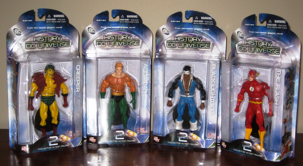
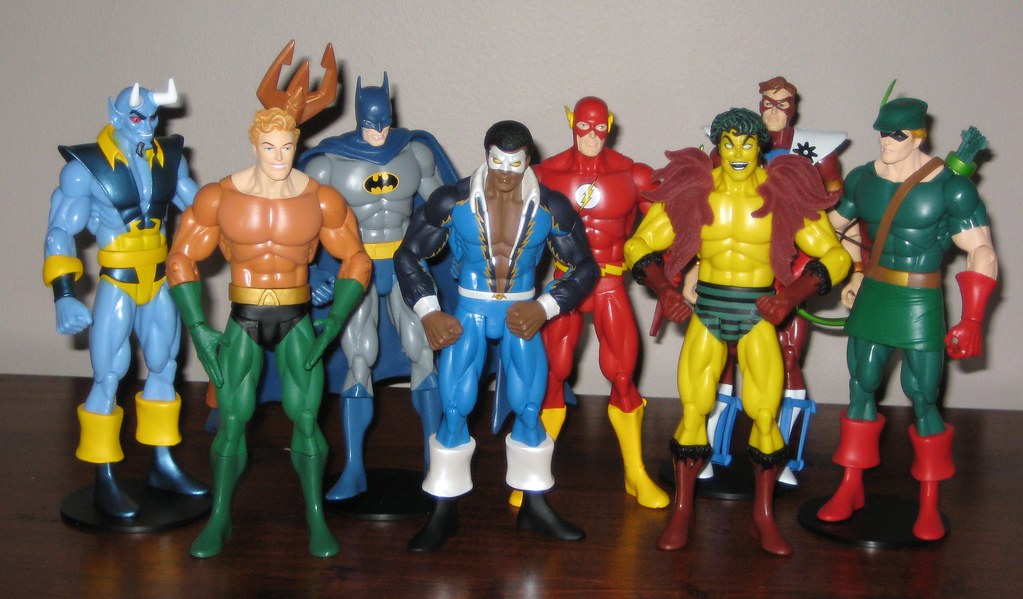
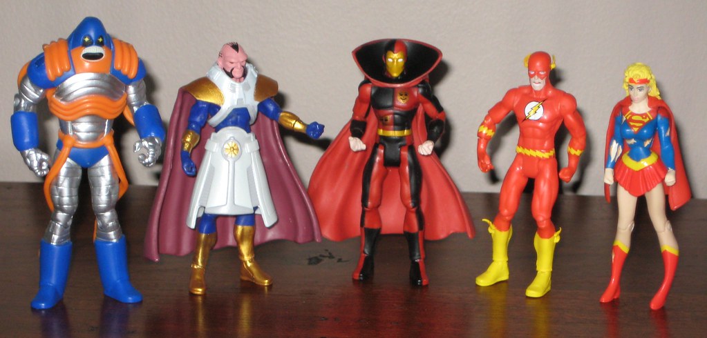
I was more excited for Wave One of the History of the DC Universe line than Wave Two based on the character selection, but was a little let down by the product – great paint apps, but I’ve found both Batman and Manhunter impossible to stand on their own and impossible to stand up straight on their bases. No matter how good a figure looks, if they don’t display properly, it’s a bit of a buzzkill. Still, the solicits for Waves Two – Four and the nice surprises - especially Kobra and a Ditko-styled Captain Atom in Wave Four – have made me keen to see where this line goes.
The buck is a sticking point. I see that the point of this line is to have something more standardised and more articulated, however the buck really needs to be a tad less roided-out to work for a wide range of characters. While there is certainly more articulation here than in the average DCD figure, it falls short for me. Ignoring a basic like ankle articulation is incredibly frustrating – rotating legs do not make up for this. The upper arm and chest crunch articulation are pretty useless. At a basic level figures should be easy to pose. Good articulation accomplishes this, and this just isn’t it.
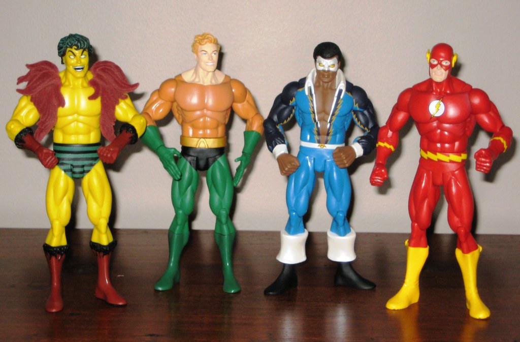 As for Wave Two, there are things to like and dislike about each figure. I was looking forward to a classic Black Lightning the most, and he is definitely the standout of the wave. The main issues here are that the bulkiness of the buck is exaggerated by his low cut shirt and lapels, and his feet have to be splayed out for him to stand properly. The colours and paint application are perfect, and the headsculpt is excellent.
Creeper’s mane, or boa or whatever it is, is flocked, and in my opinion this flocks up the figure somewhat. It’s hard to see this ageing well. I suspect there will flock-haters and flock-lovers. This bit of sculpting does help downplay the buck, as Creeper shouldn’t be so wide in the chest. Again, an excellent headsculpt, and a great addition to the plastic hero world. Not a classic Outsider, but one for the collection, although DCD’s Metamorpho and Geo-Force efforts would look positively anorexic next to these guys.
I’m always inclined to like an Aquaman figure, but this one’s hard love. His outfit features a plain orange top with no scales, he has a ridiculously cheesy grin, and the nice touch of hands with fingers extended is negated by the awkward arm articulation which means he can’t be put in any decent swimming pose, the end result being his arms look too long. Necessary for the gang to be complete, but certain to be stood near the back of the set as it grows to hide as many of its shortcomings as possible.
 Flash is a character I’ve never seen captured brilliantly in plastic form. This doesn’t fall in the brilliant category – the bulkiness really doesn’t suit – but it is serviceable. For some reason Flash makes on best on the arm articulation front and therefore looks a little more natural – except that his head has an odd tilt that I can’t correct. Call him Contemplative Flash and all is well. A yawn, but not a fail.
This series is a very transparent attempt by DCD to line up alongside DCUC, and while it will certainly get my business as long as the new characters are being produced, it’s at least five years too late if the aim is to arrest DCUC’s rise. For the pricepoint, however, I would be expecting a few different bucks and a more thoughtful approach to useful articulation.
You can see more pics at Facebook, discuss this at the AFB Forum, and comment on this post to enter the September Comment of the Month Contest!
Until next time!
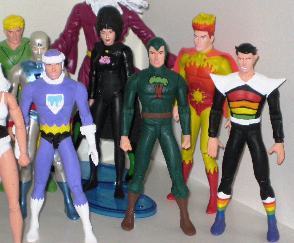 The fantastic Jackknight has come through again with some great additions to my SA Legion Collection!
 I’ll have to see what Jack has in mind, but a nice Emerald Empress would look great on my Legion shelf! If you have any other suggestions, I’d love to hear them!


 Once again, thanks to Mike for making this all possible for us, and here’s to another happy month of commenting!