 I am buying more statues than action figures these days, so I am more ahead with action figure reviews that statue posts. By reviewing DC Direct’s Brightest Day Wave 1, I’m nearly current! Of course, it would be fair to wonder what the point of Brightest Day is in the light of the DC Relaunch, but that’s a discussion for a different blog.....
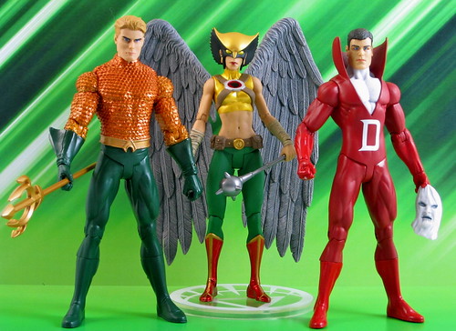
Tonight I’m reviewing three of the four figures from Wave One: Aquaman, Deadman and Hawkgirl. I decided to leave the Green Arrow figure on the shelves since I just paid a good deal more for the DCU Online Statue of him in exactly the same gear.
I’ll start with Aquaman as he’s my favourite character of the bunch. I’d love to say he’s my favourite figure of the bunch, but there’s a couple of things holding him back. On the positive side, his orange scales are very nicely done and stand out thanks to a shiny paint job. I don’t mind the costume redesign - the collar certainly modernises his classic look.
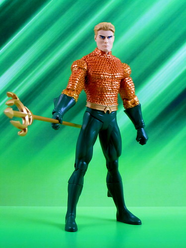 I’ve complained before about DC Direct moving from flesh coloured paint to flesh coloured plastic. The flesh coloured plastic seems to have been used on this figure, and in my opinion it suffers as a result. There is a lack of depth that results in the absence of paint on the face, and there’s something a bit off about the finish. It’s obviously a cost cutting measure, and it’s an irritating one.
The other issue I have with Aquaman is that the headsculpt doesn’t really capture the character for me. For starters, he has dark eyebrows which draw too much attention to them - does DCD know something we don’t about Arthur not being a natural blond? The result is he ends up looking much more like Superhero Ken and much less like Aquaman. I’m still glad to have this figure, for no less reason than to stand alongside the upcoming Brightest Day Mera figure, but I do feel like the figure itself could have achieved a bit more.
Deadman is an interesting contrast to the lanky version that was produced in the DC Universe Classics line. He’s more of a standard build here, which fits with his portrayal in the series these figures are based on. While the DCUC version has an open-mouthed scream sort of expression, Brightest Day Deadman looks like he’s had his lips sewn shut. Owie! All this to say that this figure stacks up differently to previous plastic incarnations of Deadman, but it’s a very valid and workable interpretation of the character.
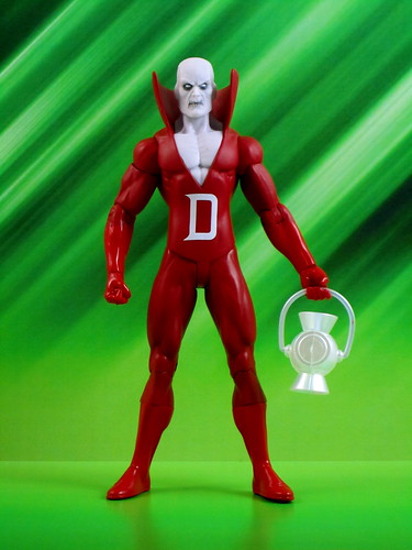 Deadman has a nice set of accessories - the kind that I’d like to see come with a 6” figure at this price point. He comes with a White Lantern, an unmasked Boston Brand head and a Deadman mask for him to hold when in unmasked / alive mode. I’m sorry to report that while the White Lantern may be the most powerful of the lot in the comics, the handle on the DCD version falls off just as easily as all the other colours!
The real stars of this set are the unmasked Boston Brand head and limp Deadman mask. The Boston head has the same issue as Aquaman in terms of the flesh-coloured plastic, but seeing as Deadman spent a good portion of Brightest Day alive (er... Aliveman..?) this swappable head has some storyline merit. I would have preferred the head to be a bit closer to the way Boston was portrayed in Brightest Day - starting with darker hair instead of the brown shown here.
The mask that Boston can hold in his left hand is a real treat - the face on the mask is sculpted on, and the flow of it in Boston’s hand is pretty amazing. This is the version that’s going on display in the Andy household, that’s for sure! A very nice touch from DCD!
The best overall figure for me in this lot has to be Hawkgirl. There have been other DCD Hawkgirl figures, but this one is the best by far, and has the added bonus of being Shiera Sanders under the Hawkgirl mask!
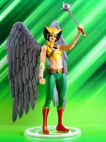 For starters, DCD has designed a very good set of wings in this particular figure. While the hyper-extendable wings that came with the original DCD Hawkman & Hawkgirl figures still take the cake, these wings are a good improvement over all of DCD’s recent efforts. They have a much easier means of attachment to the figure, requiring only some simple pressure to insert as opposed to the boil and pop I had to perform on my JSA Hawkgirl. This figure also has the best balance of the recent winged figures. She still needs the base to stand up, but on the base she can stand up straight as opposed to having to lean forward awkwardly to avoid toppling over.
Apart from these successes, Hawkgirl just plain looks great. The simple tweaks to the Hawkgirl costume in her Brightest Day redesign, particularly the black on the sides of her mask, are very effective, and they make for a striking figure. There’s a very nice sculpting job here, supported by a good paint job. I was very sorry to see Shiera not survive Brightest Day in this form - perhaps the DCNu will be an opportunity for her to return!
These figures may be the last we see of characters from the DC Universe that’s soon to be no more, but I’m going to make the most of them. There are some first-time in 6” characters coming up in the later Brightest Day waves that I am still very much looking forward to - Mera, Jade, Hawk & Dove and yes, even the new Aqualad! While there were a few niggles with these figures, if these first timers turn out as well as this first set, they’re going to very nice additions to my little plastic version of the DCU!
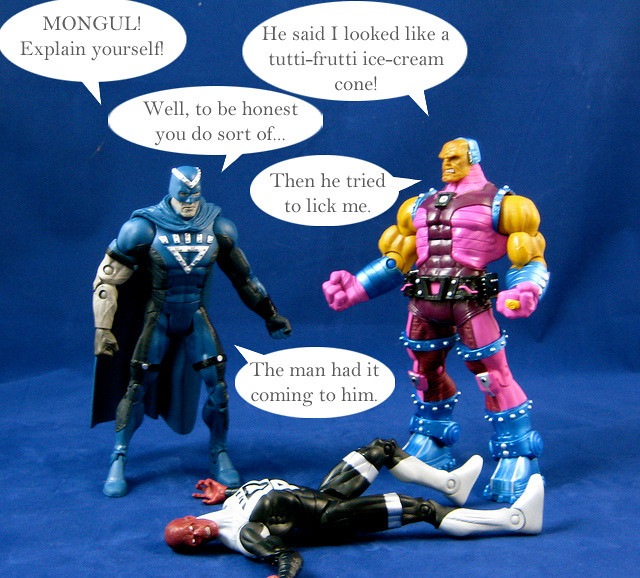
You can see more pics at Facebook, discuss this at the AFB Forum, and you can comment on this post to enter the June AFB Comment of the Month Contest! Also - don’t forget to cast your vote for the overall winner of the Toy Lines! Caption Contest!
Until next time!
 Once again, our friend Starman has some great pieces of toy history to share with us in his monthly AFB guest feature! Over to Stars!