Google+

Wednesday, March 09, 2011

It's Base-ic: DC Direct Ame-Comi Series

A while back, I decided to stop collecting DC Direct’s Ame-Comi line. This was partly influenced by the announcement of a DC-themed series for Kotobukiya’s amazing Bishoujo line, and partly because there were a few releases from the Ame-Comi line in a row that didn’t really grab or interest me, and with the very large base size of the figures, I didn’t feel I could spare the display space for them.

My resolves to stop collecting things are never terribly strong, but I really thought I was done with this line until two things caught my eye: first off, I saw that DCD was releasing a Mera figure in this line. Being the mad Aqua-fan that I am, I am really enjoying Mera’s surging popularity, so ordering that was a given. I then had a look at a couple of the newer figures in the line and noticed that the space-grabbing circular bases had been replaced by a much more modestly shaped oval base.

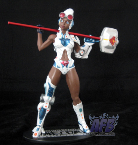
The figure that actually drew me back into the line, however, was Steel II, aka Natasha Irons. I’ve always got a soft spot for lesser-known characters making into toy and statue lines, and Natasha is a character I’ve long wished to see more from. Sadly, she’s been messed around and underutilised as a character for a long time now, so seeing her get some deserved attention in the Ame-Comi line was very gratifying.

The Steel figure itself has instantly become one of my favourite in the lines. Unlike the Kotobukiya Bishoujo statues, which are a fairly literal translation of the heroine to anime style, the Ame-Comi figures are more of a reimagining of the character into the new format. This is still very much a recognisable version of Steel but with some nice twists. Gone (thankfully) is the expressionless mask she wears in the comics in favour of an unmasked version, bit with her very recognisable helmet. Tis version shows a fair bit of skin compared to her all-armour comics get-up!

The real winner for me with this piece, however, is the pose. Standing with a wide stance, her arms are bent to hold her mallet behind her back. It’s a design that communicates strength, power and playfulness all at the same time. Her mallet comes separately and is easy to insert into Steel’s hands, although the hold is a tad precarious. This is all complimented by the previously mentioned smaller base which means that displaying this piece won’t gobble up all of your display space.
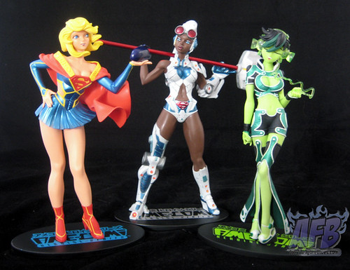
Steel was released around the same time as Ame-Comi’s second version of Supergirl. In case you don’t get the pose and what she’s holding, it’s meant to be a rear-vision mirror of a car that she’s peering into. I must admit that subtlety was momentarily lost on me, but I got it in the end! It does have a little silver-metallic sticker on it, but not an actually mirror. This is a pose and facial expression that’s on the edge of the level of cutesy-ness I can tolerate with these pieces. While I know that it’s an important element of the genre, I don’t like my heroines appearing stupid, which is why I passed on the Star Sapphire release, with her daffy lovesick pose and large purple heart she’s mooning over. Gah. What won me over here was the nice, bright metallic colour choices used in her outfit, and the fact that I haven’t come across the original Supergirl release at a price I’m willing to pay.

Supergirl has a feature that is a bit unusual in the line and that’s a bit of articulation – in this case her left arm, which can be posed at different angles. I’m not sure what the purpose of this is in this instance, since most angles take away the “looking into the mirror” effect, but it’s nice to see that DCD is able to add articulation and use it when it sees fit.

The final figure in this trio is Jade. It’s not my favourite of the lot due to the closed eyes, but the concept of her listening to headphones created by her own green energy is kind of fun, and I actually quite like the redesigned costume she’s sporting. One thing I like about these PVC pieces is the use of a combination of hard and soft plastic. A slightly softer plastic is used here for the legs of her flared trousers to good effect.

One thing that consistently detracts from the Ame-Comi pieces is sloppy paint work. Jade makes out the best of this trio, with Supergirl’s eyes suffering from a bit of fuzziness, and Steel having a blue paint blotch on her left breast. In addition, Steel’s overall paintwork doesn’t cope with the detail of the sculpt, and there are elements of the detail in Supergirl’s sculpt that feel more painted over than brought out by good paint. Disappointing on any piece, but especially here considering that these aren’t particularly cheap pieces.

I’m certainly not fully back on the Ame-Comi wagon, but I am ordering the upcoming Mera and Raven pieces and am trying to track down a Huntress and Jesse Quick for reasonable prices. I’d like the see the paintwork improve, and certainly won’t be splashing out for any repaint versions of this line, but I’m back in the hunt for the good, interesting and unusual characters – as long as the bases stay small!

You can see more pics of these and other DC Direct Ame-Comi figures at Facebook, discuss this at the AFB Forum, and comment on this post to enter the March AFB Comment of the Month Contest!

Until next time!

Tuesday, March 08, 2011

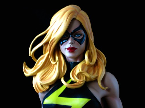
Hook, Line and Sinker: Sideshow Ms Marvel Premium Format Figure

When I first started collecting action figures, I made myself feel better by thinking something along the lines of “At least I don’t collect statues – those people spend a great deal more than I do!”. When I became a mini-bust collector, I consoled myself with similar thoughts about full-sized statue collectors. Finally, when I started adding full-sized statues to my collection, I thought: “But I’d never but any of those Sideshow Premium Format Figures – they’re huge and take up way too much space!”

Well, I really don’t know what I’m going to use to make myself feel better now, since the moment I saw Sideshow’s solicits for their Premium Format Ms Marvel figure, I knew I was sunk, because I’ve had a love affair going with this character for a very, very long time, and this piece just captures her perfectly.

I first came across Carol Danvers in the pages of Uncanny X-Men, when she had just started going by the codename Binary after losing her original Ms Marvel powers to Rogue. My interest in finding out about her history was in part responsible for my discovering and falling in love with The Avengers. When I cam back to comics after my long hiatus, Carol being in her Ms Marvel uniform again was a familiar sight amongst all of the changes that had taken place.

Ms Marvel’s most recent solo run was a wonderful read for many issues, before being derailed by too many tie-in issues for Secret Invasion and Dark Reign, and I still miss it sadly. What better way to make me feel better than to have a ¼ scale Ms Marvel adorning my display cabinets!

I didn’t bother with the Sideshow Exclusive version of this figure, which had a swap-out head, as the regular version was the head I wanted to display her with, and for some reason it’s generally cheaper to buy Sideshow’s products from other e-tailers than from Sideshow itself.

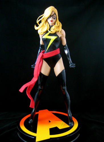
I just have to start off discussing this figure by saying that there is absolutely nothing I would change about it. It’s just about as perfect as perfect can be. The headsculpt is just gorgeous and beautifully painted – a great start to the figure. This version has the visible eyes which is the version of Ms Marvel I like best, and they are very nicely detailed. Her hair is sculpted with a great deal of detail.

I like the pose that has been chosen for this piece. It’s very strong but natural. It also allows for simple assembly – the statue element of the piece comes fully assembled except for her head, which must be attached. The also makes for a box which isn’t actually as big as I thought it might be, which means it won’t be too hard to store.

One of the features of the Premium Format figures is cloth costumes, and the detail that’s been put into the gear for this piece is pretty awe-inspiring. Her gloves and boots are vinyl, her outfit is a durable fabric and her sash comes separately. It has a metal wire running through the edges of it so that you can arrange it to get a flowing effect. One thing I was concerned about in entering into my first piece in this style is how the fabric pieces would wear, but seeing it in person has put that rest. Obviously I need to avoid dust, but if that’s done I am confident that the piece will have a long life. The only “wardrobe malfunction” Ms Marvel is in any real danger of is her costume riding up her… ahem…. at the back. As Mrs AFB Commented, you’d want to be pretty invulnerable with a skimpy outfit like that!

The figure comes on an Avengers-themed base, with the classic “A” giving it shape. It’s quite a large base, just a tad too wide to fit into my Billy bookshelves, so I have it housed in a Detolf at the moment (requiring the removal of a shelf) while I consider more permanent options.

As with so many different types of collectibles, now that I’ve had one bit of the Premium Format apple, I can’t stop there. So far I have ordered the Exclusive versions of She-Hulk and Rogue, and my mouse has been hovering over a good price on the regular version of Bucky Barnes as Captain America several times now. There are quite big pieces, so it’s not the kind of thing you can collect willy-nilly, but now that I’ve seen how nicely Ms Marvel fits into the display, it’s easy to visualise how others would compliment it.

Sigh. Well, at least I don’t collect 1:2 scale figures! I mean, those people are REALLY crazy….

You can see more pics at Facebook, discuss this at the AFB Forum, and comment on this post to enter the March AFB Comment of the Month Contest!

Until next time!

Monday, March 07, 2011

Green Lantern Classics Wave 1 - Almost Something Great

With the second wave of Mattel’s Green Lantern Classics starting to be found in stores, I thought I’d better get around to reviewing the first wave! This line is an interesting idea, and not a surprising one considering how central the Green Lantern stories have been to the DC Universe in recent times. This is a very nice wave of figures with a couple of disappointments and an overall unimaginative character selection. Let’s get to it!

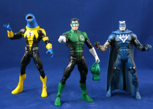
Hal Jordan’s death, resurrection and rehabilitation all took place in my time away from comics, so it took me awhile to understand where Kyle Rayner fit into the Green Lantern picture. I understand now that many people who started reading DC Comics in the 1990s consider Kyle to be “their” Green Lantern. While he isn’t my personal favourite as a character, I am absolutely loving his figure in this series.

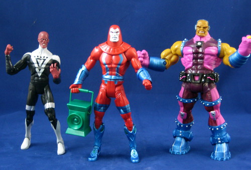
I’m quite satisfied with the two versions of Black Hand that DC Direct has produced, but the Mattel version is pretty much on par with those two figures. There’s excellent detail, and it will fit in very well the Mattel GL crew. The only thing that takes the Mattel version down a notch for me is the blank facial expression. Black Hand is as mad as a hatter, so if there’s any figure that should be scowling or screaming, it’s this fellow!

The interchangeable heads and hands for Low and Mash are easy to swap to make two completely different characters. I suspect many people like myself probably ended up buying two to display both, but it’s still a great way to make use of the similar GL / Sinestro Corp uniforms and provide more characters without forcing anyone to buy both for the CnC piece. There are both very fun, distinct characters that will compliment any GL display. A great inclusion in the wave!

I’m not much of an army builder, but I definitely plan to get a couple more Manhunters to add to my display. These are a bit smaller than the DC Direct versions from a few years back, but they’re very nicely done, with new sculpting on the armbands, legs and of course head, with a nice menacing grimace. Metallic paint is used to really make the figure come alive, and he comes with a very distinct lantern which he can hold. Mine has a sticky left ankle, so I’ll be on the lookout for that with my future purchases. This is a great effort and one I’ll commend by buying more!

Black Lantern Abin Sur was the “eye-roll” figure for me when the wave was announced. There are so many characters from the GL universe that could have taken this spot, it hardly bears thinking about. If there had to be a Blackest Night tie-in in this wave, I can think of many, many characters that would have better filled the place. Sigh! The figure itself is well designed for what it is, but I bought mine only for the CnC piece, and it won’t be on display in my house – he’ll be joining Sinestro Batman in the fodder bin.


Having said all that, however, it’s actually Mongul that’s the big disappointment for me in this wave. Partly, it’s because this is pretty much just a repainted version of the DC Superheroes Mongul, and I’m not wild about the colour choices made for the redeco. It’s also a disappointing figure for me because it’s a missed opportunity to give such an important character his first decent figure. DC Direct’s version is popular, but to me it’s ridiculously gigantic, while the DCSH . DCUC version is on the small side and too pin-headed. I would have expected Mongul to be a great candidate for the Collect and Connect treatment at some point, but I guess that’s not to be., and I think it’s a shame.

Finally, we have Arkillo as the Collect and Connect figure for the wave. This is one of those odd double-ups between Mattel and DC Direct that have been taking place recently, with the two companies producing their own versions of Arkillo at the same time. While this Arkillo uses the fairly standard body that’s been used for Kilowog and others, the DCD version isn’t actually dramatically different. The only thing the DCD version has on this one is that it has Arkillo’s tongue necklace, so if that’s important to you this one probably won’t due. If I was choosing between the two figures, I’d probably choose the DCD version for that reason, but one version of Arkillo is enough for me, so I’ll stick with this one. The sculpting work on his head, teeth and hands are excellent.

I now await the second wave of this line. We’ve yet to see the GL universe extended as imaginatively as it could by either DCD or Mattel. Here’s hoping that the wave of Green Lantern interest that is sure to come with the film provides opportunities to see some of the untapped gems from the classic years of the Green Lantern world as well as the many modern age “must-haves”.

You can see more pics at Facebook, discuss this at the AFB Forum, and comment on this post to enter the March AFB Comment of the Month Contest!

Until next time!
Sunday, March 06, 2011

DIY Comic Book Binding with dozymuppet!

I've been enjoying the opportunity this year of handing over AFB to some of our forum members who are doing amazing things, whether it be their own reviews, customs or something else entirely different.

When AFB Forum admin dozymuppet shared his efforts at not only binding his own hardback comic book collections, but also using his considerable skills to design the covers, I knew I wanted to ask him to share it here at the blog. This post will contain many more images than normal, but you'll understand why when you see how amazing the process is!

I think you'll also understand why I've already booked in with dozy to have some of my own comics bound in this fantastic way!

Without further ado, over to dozymuppet!

------------

Welcome to what is essentially a step-by-step do-it-yourself experience for binding a bunch of comics. It will be image-heavy.

It's taken me a long time to get to this point. I've been hoarding Firestorm and JLA issues with the intention of putting together some custom bindings, inspired by the fantastic work I've seen done for others by binderies in the States. After much investigation, it didn't look like I could get good quality binding done in Oz for a price that made it interesting.

This led to me contemplating what was actually involved in a DIY approach. After looking at a bunch of examples and some pretty ordinary instructions, I stumbled across this guy's YouTube channel: http://www.youtube.com/user/Ceropegia

After much study, I was pretty confident I could give it a decent go. I just needed the bits and pieces, and a couple hours spare time to kick things off.

Rather than start with what will be "my precious", i.e. Firestorm, I started with something else that didn't cost me much of an outlay. I know Kirby's Black Panther run has already been collected in trade form, but I liked the idea of having a volume to put next to the Forth World and Demon books from DC. I even threw in the final few non-Kirby issues from that run for good measure.

Here are all the issues, staples removed, and a simple contents page printed:

The "signatures" are sewn, using the first kettle stitch:

In book-talk, a signature is a group of pages that are folded together. Signatures are the parts that together make a book "block". With a comic book, you've got a ready-made signature.

All signatures sewn together:


Here is the block with endpapers "tipped on".


"Tipped on" means only the edge (about 5mm) of the folded endpaper is glued, and then fixed to the title page.

Now, you'll have to pretend the following "yellow" sequence is from this project, as I didn't take the corresponding action shots for the Black panther book. (This is actually the first of a series of annuals I am doing for my boy, of a Swedish book that has been running since 1973, and features a character named after my boy's great grandfather... but that's a story for another day...)

First up, the tools. Top left you can see regular paper, muslin, and headbands.

First glue, getting into all the "shadows". Shortly after doing this, you could round the spine, but that's not the effect I'm after. This was left to dry in the press overnight before the actual "dressing".


Second glue, with headbands on. You can also see a ribbon bookmark, and this is the first time I've put one in.

Muslin on. You can put this on before the headbands, but it just happened in this order today... Don't judge me.


The muslin doesn't need to go the whole length of the spine, as long as the combination of headbands and muslin cover the whole thing.

Everything worked into the glue with a bone folder, and the muslin folded over.

Third glue, getting into all the wholes in the muslin.


First paper layer, worked in with the bone folder.

Second paper layer, just folded back onto itself. The glue-wet paper allows an easy fold back.

Excess paper torn off. Again, the glue-wet paper allows this to be done simply.

And into the $8.52 press! Leave overnight. Book block complete. What you end up with is a sturdy, but flexbile book block. Now for the glory part: Putting the cover on, AKA "casing-in".

Tools and preparation:

You can see the boards top-left, which were measured and cut precisely to be the same width of the block, but with an extra 3mm top and bottom. The cover is printed on one A3 sheet. Unfortunately I don't have easy access to edge-to-edge printing, so I need to keep everything very precise because I don't have a lot of bleed to play with. Which leads me to the next picture, showing the cover ready for gluing.

If you look closely, you'll see guidelines for placing the boards, so I get the spine (in particular) in the right place:

Next, I glue on the calico spine dressing, for additional strength in the folds:

I use a bone folder to get it into the creases. Next I trim the corners, but not right to the edge, as I need to get a nice corner fold:

Here you can see three edges folded over. There's a neat little tip to do this using the base of your thumb, but tricky to catch on a stills camera...

Once this is done, I place the block into the cover (not gluing it in just yet), and fold it over so that it has a shape to dry around. Before putting into my $8.52 home press, I also score the folds around the spine while it is still moist to get that nice effect you're so used to seeing:

After about 20 minutes, I take it all out of the press and make sure it's lined up nicely on the cover:

Then I glue down the spine dressing and tape:

Before gluing up the endpaper:

I close the cover over the glued endpaper, and then repeat on the other side, close the book, then score the folds again:

And into the awesome $8.52 press again:

Wait several hours...

------

Many thanks to dozy for this amazing insight into his skills and effort! You can comment on this post to enter the March AFB Comment of the Month Contest!

Until next time!

Saturday, March 05, 2011

Nothing "Wrecked" About Bowen's Latest Bust Multi-Pack

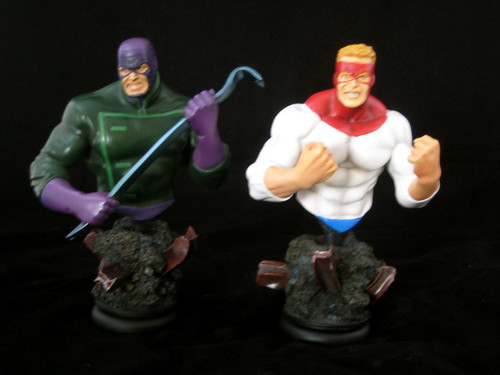
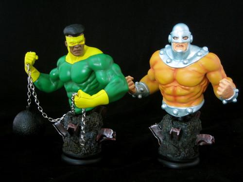
After many years in the collectables wilderness, Marvel’s criminal foursome, The Wrecking Crew, has finally received some much welcome attention in the last year or so. They were made into 3 ¾” figures by Hasbro in the Secret Wars / Marvel Universe line, and now they’ve become available in mini-bust form thanks to a four-pack of busts from Bowen Designs. I got to know this motley crew in the original Secret Wars back in the day and then looked up many of their earlier appearances, so when I first saw this set solicited I knew I’d be ordering it.

Bowen has been exploring larger sets of busts in recent times, with the web-exclusive Guardians of the Galaxy set (something I’m yet to own) and more recently the very fun Warriors Three set. It’s a clever way of packaging together characters that may not sell so well individually for fans who will want the complete set anyway.

The Wrecker is a great creation from Stan Lee and Jack Kirby and a classic Thor villain very deserving of a place in the Bowen line (and perhaps a Full Sized Statue of his own at some point). He’s certainly been done justice here. He’s poised to do some serious damage with his Asgardian-enchanted crowbar, and is sculpted with a truly menacing look in his face. Sculpt and paint are pretty much perfect on this piece, and I really like the pose. He’s sculpted at an angle with his crowbar at the ready, and as well as looking great it makes him the

perfect character to place at the front of the Wrecking Crew display.

I can only imagine the challenges involved in designing statues with moving parts or attachments, like Thunderball’s…. thunderball. The ball is quite lightweight to keep it from overbalancing the bust, but it definitely looks the part. This is complimented by a great sculpt and an excellent paint job that really captures the character. I also like the threatening pose. Thunderball and Wrecker make great bookends! His face is also the best done of all of the pieces since he doesn’t have visible eyes – the eyes on the other pieces are all just the tiniest bit off to me.

I’m pleased that the look chosen for Bulldozer is more classic than modern age. He hasn’t always been quite as gigantic as he is now, and his headgear in the comics just keeps getting bigger and crazier. This bust is the look I much prefer for him, with a nice use of metal paint for his helmet. He has a suitably crazed look and aggressive pose. I like the way that his helmet covers his nose – it makes his scowl look part scary and part dumb.

Piledriver is the only bust in this set that I have any real concerns with. It’s something in the face – perhaps the darker tone used to paint his lips – that causes the eye to be drawn to it above the rest of the piece, and it just doesn’t quite fit. It’s also the least dynamic pose, although I think it’s been chosen to highlight Piledriver’s main weapons – his fists. Certainly not a miss, but without a doubt my least favourite of the set.

Each character sits on a matching base with rock and twisted girders. Considering that these were made to be a set, it might have been an idea to set these at different heights for display, but that’s not the case here, so it’s up to the creativity of the collector to find ways to set them out.

This set is a great example of one of the reasons I love Randy Bowen’s product: he knows and understands the Marvel Universe as much as we do. I’m hopeful that Bowen’s efforts with sets of busts will continue, as there are a number of groups / teams of Marvel characters I’d love to see in this form: The Squadron Supreme, Masters of Evil and U-Foes are some examples that come to mind.

You can see more pics of these and other Bowen Busts at Facebook, discuss this at the AFB Forum, and comment on this post to enter the March AFB Comment of the Month Contest!

Until next time!
Thursday, March 03, 2011

Many, many months of MOTUC!

Moving interstate is full on, and things fall through the cracks when you do. That’s the only explanation I can come up with for the boo-boo I’m about to confess.

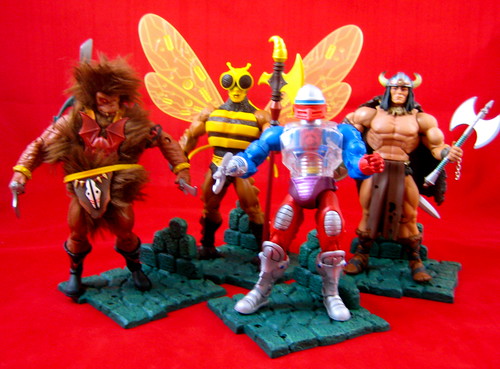
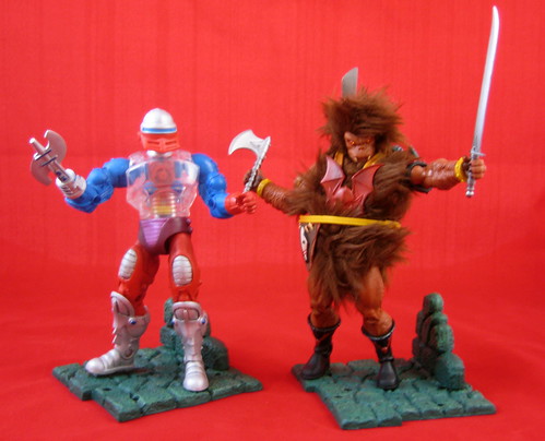
I was putting together my review of Mattel’s Masters of the Universe Classics Buzz-Off and Vikor, when I realised that I had written but never posted a review of the previous two releases, Roboto and Grizzlor. Oops! In some cases I’d just move on, but I had to go back and look at the first two, and one of them is currently my favourite MOTUC figure! Also, my original pics for these two were more dodgy than my usual dodgy pics, so it was a good excuse to have a redo. So, get ready for a mega-MOTUC Catch-up!

Way back in November came Roboto. This is a bit of a “meh” MOTUC figure for me. Many of the characters that are coming out in this line go beyond my MOTOC knowledge, and that’s not an issue for me, as I like many of the styles and choices in the line and really love the figures of some characters I didn’t previously know (see Grizzlor below). The issue here is that Roboto is quite outside the normal aesthetic of the line, and as I have no connection with him, I’m not that wild about him. The transparent pieces are definitely a very cool design. This just isn’t a figure that’s going to do more in my MOTUC display than hang around in the background and wish he had friends.

I love the snap-on tools element of the MOTUC figures, and Roboto has extra pieces / hands that fit in nicely into the attachments on his back. This design element is a real bonus for someone like me who isn’t overly interested in accessories and doesn’t have a great storage system for them.

Grizzlor is one of those MOTUC characters that I only have vague recollection of from the vintage years, but he’s a novelty in the line because he’s, well... cute and fuzzy. In a line that can seem same-ish at times due to the reused buck and design elements, Grizzlor is a welcome change. He’s also a toy with personality. When I was taking photos of him, there was an angle where his fur was hanging over his face in such a funny way, that I just fell in love with the guy. Until Ram-Man comes along, Grizzlor is my MOTUC star.

I had a swag of toys to unpack the day I opened Grizzlor, and thus unlisted the help of the AFB-ettes. (Or, as we sometimes call them in our household, “anti-helpers”. As such, I didn’t personally open this fuzzy guy, and thus he was presented to me with his belt unbuckled, and I really can’t work out how to reattach it. Thankfully due to all the fur and fuzz it isn’t noticeable. He still comes with a fun range of accessories. I especially love his machete style sword!

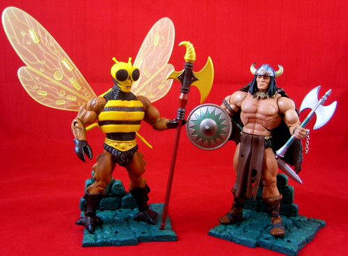
Buzz-Off is a memorable character from the original line, and one that I, like many others, have been greatly looking forward to seeing the Four Horsemen version of. It was a bit of a wait, but well worth it, as this figure has turned out brilliantly. There is some serious sculpting work here, from the small detail of Buzz-Off’s torso and face to his headsculpt with removable helmet. He has articulated pincers for hands which just hold his staff. He has some interesting ridges that run down the side of this legs to three-toed street.

All of that positive comment comes before I’ve even started discussing Buzz-Off’s wings. These are beautifully designed. They are translucent with a detailed pattern in them, and swing to a number of different angles, great for posing in fight or flight modes. They are quite high when fully extended, in fact too high for the shelf in my Billy Bookcase I have my MOTUC figures displayed in to be displayed fully extended. Truly an excellent piece.

Vikor was the first MOTUC subscription figure that I have considered off-loading, but that was before I received him. I think he’s a bit of a stretch for inclusion in the line, but he’s a good looking figure, and I’ve decided he’s worth keeping on that merit alone. I found removing him from the package quite a challenge, as his cape was well and truly stuck in the plastic insert and the attachment didn’t appear terribly secure, which made me afraid of breaking it. In the end, I used scissors to free him to be sure.

Vikor is another good example of what can be done with the basic MOTUC buck simply through accessories. There’s no particularly special new sculpting on the buck itself, but his helmet, cape and accessories work together to make quite a distinct and different figure. Considering my apathy towards the character, I’m quite surprised by how much I actually like Vikor now that he’s on my shelf. He’s not going to star in any of my displays, but he fits better in my mind than Roboto.

So that moves me a bit closer to being caught up on MOTUC stuff – good thing too, since my February items just arrived today!

You can see more pics on Facebook, discuss this at the AFB Forum, and comment on this post to enter the March AFB Comment of the Month Contest!

Until next time!
Tuesday, March 01, 2011

March Madness! The AFB Comment Contest for March 2011!

First off, thanks to everyone who commented on last month’s blog posts! Congratulations to dj jimenez for being our randomly selected winner! My random number generator at Random.org has yet to choose repeat winner in all the time the contest has been going! Very clever! Once we hear from dj (you can contact me through the AFB Forum - send a message to "Andy"), his choice of either the DC Universe Classics Wave 16 Robin figure from Mattel or the Yellow Eternal Dalek figure from Character Options will be on the way when available from Mike’s Comics N’ Stuff.

Now to March’s Contest: on offer are two great prizes, either the DC Direct Arkham Asylum Series 1 Joker & Scarface Two-Pack figures from DC Direct or the Uncanny X-Force Minimates set from Diamond Select - either of which would be a great prize!

A few bits and pieces:

  • every genuine comment on a post from the calendar month will be eligible to receive the prize. I’m going to stick to my own time zone and call it at 23:59:59 Australian Eastern Standard Time – best to comment often and comment early!

  • if my super scientific randomizer comment selector system chooses an Anonymous comment, I’ll skip it and go again – you need to leave a name, a link, your AFB Forum username or email addy so that I can contact you if you are the winner. Blogger comments allows you to do this, as long as your profile is not set to private – check your settings.

  • you will be given a choice of one of the two figures on offer from the month’s contest – figures will be in their original packaging.

  • figures will be sent by first class mail within the US (Mike is sending them, remember) and first class international to any overseas winner. An overseas winner can elect to chip in for Priority Mail or Insurance, but otherwise we can’t take any responsibility for a parcel that doesn’t arrive – after all this is coming out of AFB’s not dreadfully deep pockets!

Once again, thanks to Mike for making this all possible for us, and here’s to another happy month of commenting!

Until next time!


Related Posts Plugin for WordPress, Blogger...