 I have been becoming more and more appreciative of Kotobukiya’s Marvel Statue efforts. I am a diehard fan of their Bishoujo lines but only have a couple of their larger statues, namely the Fall of the Hulks set and their Dr Doom Statue. I can now add another to that list – the Kotobukiya Captain America (Bucky Barnes) Statue. I’m happy to report it’s a very happy addition!
I know that many readers haven’t enjoyed Bucky’s turn as Captain America and will welcome Steve Rogers’ imminent return to the role. I have been quite a fan of this run – nothing against Steve, as I always knew he’d be back, but it’s been an interesting character study and a great way of transitioning Bucky to true hero status after his Winter Soldier days.
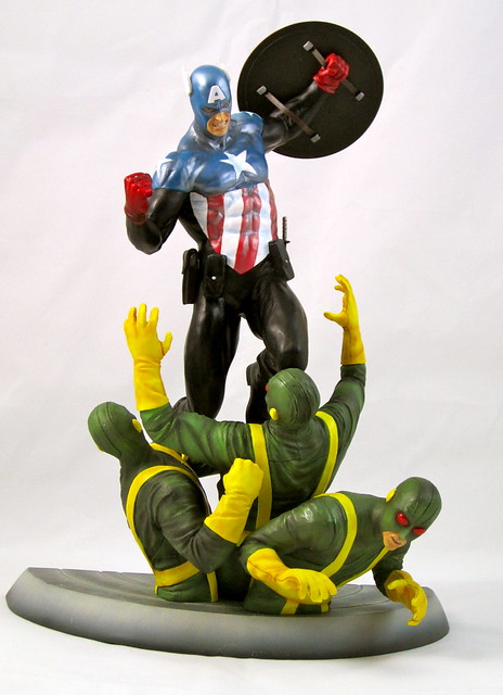
In addition to the character development and different shadings Bucky has brought to the role in his time with the shield, I also really like his version of the Captain America costume. It’s a very logical updating of the classic gear, and the darker tones used illustrate some of the darker edges that Bucky brings to his approach to the role.
I imagine that sculptors must enjoy action poses like this as it really gives them an opportunity to show off their skills. The understanding of human anatomy required to compose something like this takes my breath away. The pose and musculature involved in putting Bucky together is really outstanding. This is one of the most dynamically posed statues I have in my collection. Bucky is beautifully posed, and having the extra characters there greatly helps to illustrate his action and add energy to the statue.
I haven’t always been sold on the face sculpts for Koto’s human characters in their statue line, but Cap’s is excellent. It’s clear, detailed and very determined. This improvement is really encouraging to see!
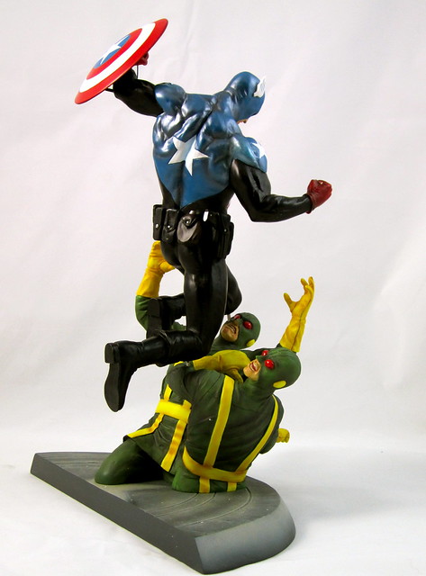
The paint on this statue is outstanding. A very nice range of matte, glossy and metallic finished are used to provide a very nice range of texture. The colour choices are excellent across the board. Something I really like about the paint on this piece is the way that the red and blue on Bucky’s outfit are quite different from the same colours on his shield – not in tone, but strength – it really makes his outfit look like fabric and his shield look like metal. I don’t think I’ve explained that particularly well, but look at the pics and hopefully you’ll see!
 I like that Koto is distinguishing itself from its competitors in the 12” –ish statue department through the inclusion of these more detailed bases, be it the inclusion of other characters or more complex diorama-style bases that come together to tell a story, such as their X-Men Danger Room Series, which I’ll be venturing into shortly. The HYDRA are classic Marvel villains and it’s great to see them featured here.
Another likeable thing about this statue is that it can be displayed at a range of angles depending on what you want to feature. You can have Cap face-on to get the fullness of his gear and facial expression, or go for a side-on view to get more of the effect of Cap piling on to the Hydra Agents and get a view of the shield. It is a bit of a shame that you only see the back of the shield when the statue is positioned with Cap facing the front, which is my favourite angle, but I think it would have been pretty difficult to come up with a pose that provided that and was still as dynamic and effective.
This statue is a very encouraging purchase – I’ve loved what Koto has done with oversized characters like the Hulks, but been a bit reticent to delve in to their work on these types of characters. With the great work done on this piece and Kotobukiya’s highly competitive pricing, expect to see more of their pieces gracing my shelves!
You can see more pics at Facebook, discuss this at the AFB Forum and comment on this post to enter the April AFB Comment of the Month Contest!
Also, don’t forget to check out the two contests we have going at the moment: the “That ‘70s Custom” Custom Contest and the third round of our first “Toy Lines!” Caption Contest!
Until next time!
2 comments:
Nice review, looks like a great statue.
Pretty nice looking statue. : )
Post a Comment