 I’m certainly leaner towards larger scales of collectables these days, but there is something about Hasbro’s Marvel Universe 3 ¾” line that keeps me coming back. It isn’t the consistent quality of the figures, rather it’s the huge array of characters that Hasbro is bringing to the line. My collecting habits are generally about team / universe building, and this line definitely feeds that interest!
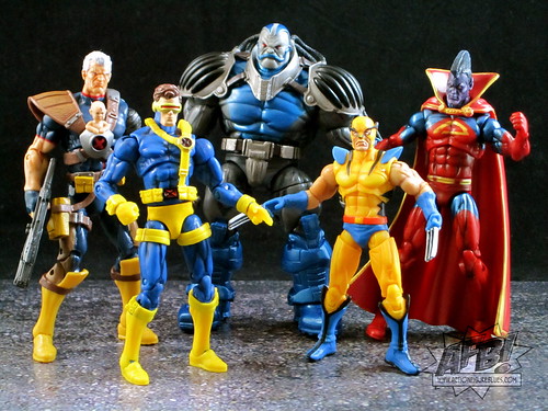
Tonight I’m reviewing Wave 13 of the Marvel Universe line, which includes Cyclops (Jim Lee version), Cable, Gladiator, First Appearance Wolverine and Apocalypse. While there are some individual niggles with some of these figures, this is overall a very strong wave which makes some great additions to the line.
The pick of the wave for me is Cyclops. We’ve had a couple of Cyke versions in this scale, but this one in his Jim Lee-styled gear is the strongest by far. This figure has some new elements - in particular much better ankles which have side articulation as well as front / back. This allows a great deal more in terms of poseability and I hope it becomes a standard in the line.
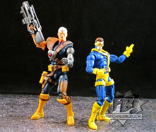 The real highlight of this figure, however, is the headsculpt. These 3 ¾” are not always stellar in this category, but Cyclops is a very happy exception to this. It’s very detailed and a spitting image for his comic look. It’s very ably backed up by a great paint job - definitely my favourite of the wave!
The only mark against Cyclops is his belt and harness. It’s been sculpted separately, which has the potential to be a nice touch, but it isn’t a great fit and tends to ride up. I suppose adding this as a separate piece was cheaper than adding it as a fixed part of the sculpt, but it does detract ever so slightly from the overall look.
Cable comes in two packouts - one with Baby Hope in her X-Harness, and one with out. Mine is the Hope-ful version, but I am actually leaning towards displaying him Hope-less simply because the little sculpted baby looks pretty ridiculous. It’s a great touch and references a significant storyline, and the look of the baby is consistent with some comic appearances (like the cover of the most recent Cable #1) but the end result is just a tad goofy looking. Thankfully the figure does come with a swap-out X symbol that Hope can be removed.
 Creepy Plastic Baby aside, this is a very solid figure with some very nicely sculpted custom pieces and attachments. His headsculpt is a little bit lacking in detail but works well, and all of his attachments fit snugly. This is a brand new buck for the line which gives us a taller muscular male - let’s hope it’s used to bring us some more new characters to the line!
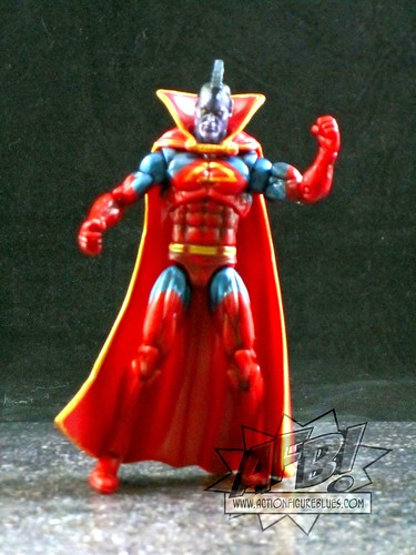
Gladiator is a very welcome addition to the line - I like getting the lesser known characters and I’ve always had an interest in Kallark since reading the death of Jean Grey - the first one - back in the day. He’s had the limelight a bit lately with Realm of Kings and Annihilators, and definitely belongs in this line. The standard sculpt works well with custom cape and mohawk to good effect.
Unfortunately, Gladiator is let down by the paint job on his face. There are two tones of purple here which may have been used for contrast, but the lighter purple is so light that he looks like he’s contracted a Shi’ar version of Vitiligo, the condition where the skin loses its pigment. The rest of the paint job is stellar, so the face crud really is a shame. I’m still glad to have Gladiator in the collection, but he definitely loses marks for the paint issues.
First Appearance Wolverine is actually a fairly good representation of Wolvie’s debut in Incredible Hulk #181, but he’s still the runt of this litter. His face is a good attempt at the FA look, but the lines aren’t quite defined enough. He is at a good scale in comparison to the other figures, and that’s about the best I can say about him.
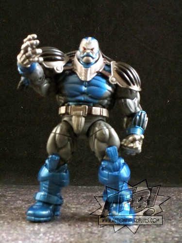 Hasbro has been fairly consistent in doing the oversize characters very well in this line. Apocalypse definitely falls into that category. He looks great, and nothing lets him down in terms of sculpt or paint. I love his groovy super-despot shoulder pads!
The only thing I’d suggest as an improvement would be an open mouth to avoid the clown-lips sort of look that Apocalypse can fall victim to. He has a suitably evil expression otherwise which saves him from losing any marks. He’s a great figure nonetheless, and a fantastic addition to the collection.
First Appearance Wolverine is actually a fairly good representation of Wolvie’s debut in Incredible Hulk #181, but he’s still the runt of this litter. His face is a good attempt at the FA look, but the lines aren’t quite defined enough. He is at a good scale in comparison to the other figures, and that’s about the best I can say about him.
Hasbro has been fairly consistent in doing the oversize characters very well in this line. Apocalypse definitely falls into that category. He looks great, and nothing lets him down in terms of sculpt or paint. I love his groovy super-despot shoulder pads!The only thing I’d suggest as an improvement would be an open mouth to avoid the clown-lips sort of look that Apocalypse can fall victim to. He has a suitably evil expression otherwise which saves him from losing any marks. He’s a great figure nonetheless, and a fantastic addition to the collection.
This wave has a nice symmetry to in in terms of theme, and yet delivered some nice new additions to the MU line at the same time. This sort of design - and this overall level of quality - will see me continuing to collect Marvel Universe for some time to come!
You can see more pics at Facebook, discuss this at the AFB Forum, and you can comment on this post to enter the June AFB Comment of the Month Contest!
Until next time!
Until next time!
4 comments:
as u said this wave is pretty consistent & has great additions except Wolvy, he looks too weird (though comic accurate) & i think this character lacks of a good representation in this line... the bigger figures (like Apocalypse) except the Hulk green & red versions r pretty well done too
If they had of swapped out Wolvie someone else (anyone else) that'd be a great wave for me.
I think of the bunch i really like Wolvie and then Gladiator. : )
I'm hoping to get my hands on a Cable figure. I do have the Apocalypse, and agree that he's pretty darn cool.
Post a Comment