 I don’t know what it is about Bizarro that makes him a must-buy character for me. It probably is his Silver Age roots, supported by his more recent appearances in some of Jim Starlin’s DC work. Whatever nastiness modern age writers have instilled in him at times, there’s something inherently goofy about Bizarro that gives him an appeal to me, and that’s what hooked me in to my purchase of the DC Direct Ultimate Showdown Superman vs. Bizarro Statues.
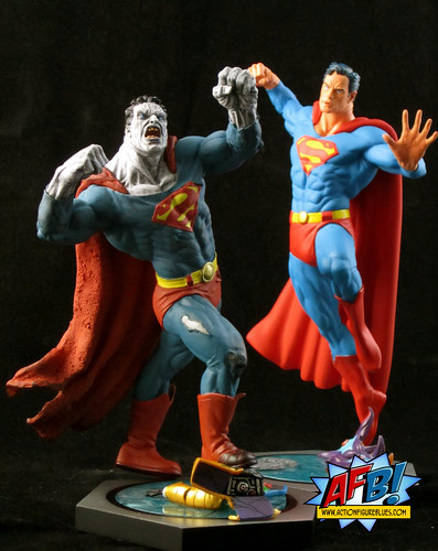
Tim Bruckner has a long history with DC Direct, and of late has been sculpting specific lines such as the fabulous DC Dynamics Series as opposed to one-off pieces. The Ultimate Showdown Series is his latest effort, and it’s quite a different concept. Each statue sits on a rotating disc within its own hexagonal base, allowing the collector to display the pieces at a range of angles. Further, each statue has an articulated neck for extra posing options.
Bruckner’s Superman is a very classic version of our favourite Kryptonian, and I’m not just talking about the now-extinct red trunks - the headsculpt is very Silver Age, and the whole piece looks like it could have sprung right off the pages of a vintage comic. He is the taller figure of the two, perfect for being posed as the eventual victor of whatever battle you design. The pose is quite dynamic, with Superman in the air looking ready to land or defend a punch from his mixed-up foe. 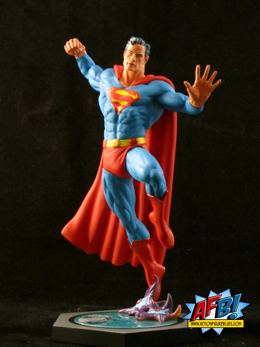
It’s a beautiful statue, but I have two reservations. The first is just a niggle: his left hand, which is outstretched, looks a little bit oversized, like it would fully cover his head. It might just be the angle, but it does look a bit odd to me. The second is his facial expression - for something called “Ultimate Showdown”, Superman doesn’t look particularly showdown-y - I would have loved a more focused or even angry expression. Like I said, it’s a really good looking piece, but perhaps lacks the “oomph” needed for this set. You could never fault Bruckner’s sculpting, but the expression needed more in this reviewer’s humble opinion.
Bizarro is an interesting contrast to the very classic looking Superman, as he’s depicted here in his more Modern Age “zombified” incarnation - not my favourite of Bizzy’s “looks”. The modern, hulking Bizarro strays too far away from the original idea of a “reverse Superman” of sorts for me. I realise that his Silver Age look would be far too cartoonish for today’s comics, but I don’t quite get the leap to zombie. My Bizarro two cents on that one.
Whatever you think of the way Bizarro is depicted in this day and age, Bruckner has executed the look very well. Brucker has really gone for the bizarre in this sculpt, and the pose itself is rather unusual, creating a cumbersome and unwieldy sort of look which suits Bizarro to a tee.
The headsculpt is suitably garish, and I especially like the that his cape and uniform aren’t just rippped and tattered versions of Superman’s uniform, but have a different texture as well. It’s intricate stuff and beautifully detailed, especially for the scale.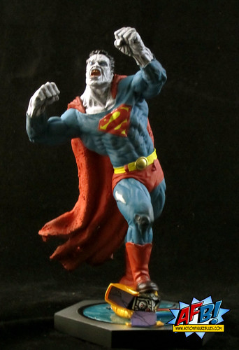 The rotating bases and articulated necks are a great idea, but there are limitations to their usefulness. There is only a limited range in either direction whereby the necks can be rotated and look natural, and only a limited range of angles the statues can be placed at where they appear to be relating to each other. It’s a great concept, but it doesn’t end up being quite as flexible as I had expected it to be.
The bases themselves are interesting. As well as the rotating features, there are several pieces adorning the base, including Starro spores. I’m not totally clear on their purpose, but they definitely add to the overall picture.
One thing to note is that these are not large pieces - Superman comes in at 8.5” while Bizarro is shorter. These are along the line of a Batman Black & White statue or a DC Universe Online piece rather than the larger DCD “Vs” statues such as Batgirl vs. Catwoman, etc. This isn’t a drawback for me since display space is at a premium at my place, but it is something be aware of for the prospective buyer.
All up, this adds nicely to my Bizarro collection, but I’m not enamored enough with the piece to buy other sets in the line - unless Aquaman makes an appearance of course, which means I’m probably safe from any more purchases.
You can see more pics at Facebook, discuss this at the AFB Forum, and you can comment on this post to enter the September AFB Comment of the Month Contest!
Until next time!
* The title of this post is Bizarro speak - I'm quite happy with it, really!
5 comments:
indeed they’re both great statues... i love the whole sculpt and paint job, i’m not familiarized with Bruckner, but this work makes me feel he’s a great artist...
These figures do look fantastic, but I am with you on the classic reverse copy of Superman version over the hulking zombie version. Although, this version might be a bit more menacing. Still very cool looking figures.
Reading this post made me wonder what Bizarro will look like in the rebooted DC Universe. Assuming he'll still be around, which I hope that he is!
A great concept. Points to DCDirect for trying something new. Nice review Andy!
Not really liking this statue, myself. Probably too silver age for me.
Post a Comment