Google+

Sunday, March 06, 2011

DIY Comic Book Binding with dozymuppet!

I've been enjoying the opportunity this year of handing over AFB to some of our forum members who are doing amazing things, whether it be their own reviews, customs or something else entirely different.

When AFB Forum admin dozymuppet shared his efforts at not only binding his own hardback comic book collections, but also using his considerable skills to design the covers, I knew I wanted to ask him to share it here at the blog. This post will contain many more images than normal, but you'll understand why when you see how amazing the process is!

I think you'll also understand why I've already booked in with dozy to have some of my own comics bound in this fantastic way!

Without further ado, over to dozymuppet!

------------

Welcome to what is essentially a step-by-step do-it-yourself experience for binding a bunch of comics. It will be image-heavy.

It's taken me a long time to get to this point. I've been hoarding Firestorm and JLA issues with the intention of putting together some custom bindings, inspired by the fantastic work I've seen done for others by binderies in the States. After much investigation, it didn't look like I could get good quality binding done in Oz for a price that made it interesting.

This led to me contemplating what was actually involved in a DIY approach. After looking at a bunch of examples and some pretty ordinary instructions, I stumbled across this guy's YouTube channel: http://www.youtube.com/user/Ceropegia

After much study, I was pretty confident I could give it a decent go. I just needed the bits and pieces, and a couple hours spare time to kick things off.

Rather than start with what will be "my precious", i.e. Firestorm, I started with something else that didn't cost me much of an outlay. I know Kirby's Black Panther run has already been collected in trade form, but I liked the idea of having a volume to put next to the Forth World and Demon books from DC. I even threw in the final few non-Kirby issues from that run for good measure.

Here are all the issues, staples removed, and a simple contents page printed:

The "signatures" are sewn, using the first kettle stitch:

In book-talk, a signature is a group of pages that are folded together. Signatures are the parts that together make a book "block". With a comic book, you've got a ready-made signature.

All signatures sewn together:


Here is the block with endpapers "tipped on".


"Tipped on" means only the edge (about 5mm) of the folded endpaper is glued, and then fixed to the title page.

Now, you'll have to pretend the following "yellow" sequence is from this project, as I didn't take the corresponding action shots for the Black panther book. (This is actually the first of a series of annuals I am doing for my boy, of a Swedish book that has been running since 1973, and features a character named after my boy's great grandfather... but that's a story for another day...)

First up, the tools. Top left you can see regular paper, muslin, and headbands.

First glue, getting into all the "shadows". Shortly after doing this, you could round the spine, but that's not the effect I'm after. This was left to dry in the press overnight before the actual "dressing".


Second glue, with headbands on. You can also see a ribbon bookmark, and this is the first time I've put one in.

Muslin on. You can put this on before the headbands, but it just happened in this order today... Don't judge me.


The muslin doesn't need to go the whole length of the spine, as long as the combination of headbands and muslin cover the whole thing.

Everything worked into the glue with a bone folder, and the muslin folded over.

Third glue, getting into all the wholes in the muslin.


First paper layer, worked in with the bone folder.

Second paper layer, just folded back onto itself. The glue-wet paper allows an easy fold back.

Excess paper torn off. Again, the glue-wet paper allows this to be done simply.

And into the $8.52 press! Leave overnight. Book block complete. What you end up with is a sturdy, but flexbile book block. Now for the glory part: Putting the cover on, AKA "casing-in".

Tools and preparation:

You can see the boards top-left, which were measured and cut precisely to be the same width of the block, but with an extra 3mm top and bottom. The cover is printed on one A3 sheet. Unfortunately I don't have easy access to edge-to-edge printing, so I need to keep everything very precise because I don't have a lot of bleed to play with. Which leads me to the next picture, showing the cover ready for gluing.

If you look closely, you'll see guidelines for placing the boards, so I get the spine (in particular) in the right place:

Next, I glue on the calico spine dressing, for additional strength in the folds:

I use a bone folder to get it into the creases. Next I trim the corners, but not right to the edge, as I need to get a nice corner fold:

Here you can see three edges folded over. There's a neat little tip to do this using the base of your thumb, but tricky to catch on a stills camera...

Once this is done, I place the block into the cover (not gluing it in just yet), and fold it over so that it has a shape to dry around. Before putting into my $8.52 home press, I also score the folds around the spine while it is still moist to get that nice effect you're so used to seeing:

After about 20 minutes, I take it all out of the press and make sure it's lined up nicely on the cover:

Then I glue down the spine dressing and tape:

Before gluing up the endpaper:

I close the cover over the glued endpaper, and then repeat on the other side, close the book, then score the folds again:

And into the awesome $8.52 press again:

Wait several hours...

------

Many thanks to dozy for this amazing insight into his skills and effort! You can comment on this post to enter the March AFB Comment of the Month Contest!

Until next time!

Saturday, March 05, 2011

Nothing "Wrecked" About Bowen's Latest Bust Multi-Pack

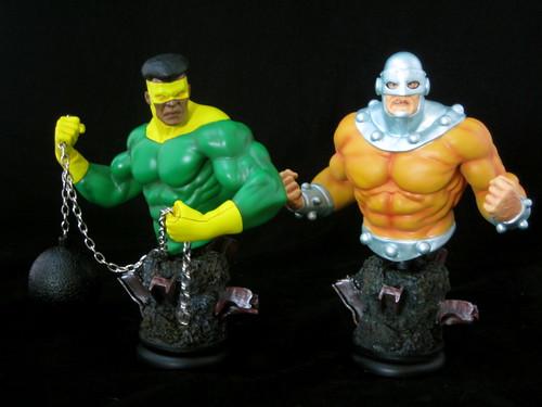
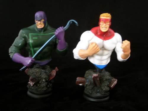
After many years in the collectables wilderness, Marvel’s criminal foursome, The Wrecking Crew, has finally received some much welcome attention in the last year or so. They were made into 3 ¾” figures by Hasbro in the Secret Wars / Marvel Universe line, and now they’ve become available in mini-bust form thanks to a four-pack of busts from Bowen Designs. I got to know this motley crew in the original Secret Wars back in the day and then looked up many of their earlier appearances, so when I first saw this set solicited I knew I’d be ordering it.

Bowen has been exploring larger sets of busts in recent times, with the web-exclusive Guardians of the Galaxy set (something I’m yet to own) and more recently the very fun Warriors Three set. It’s a clever way of packaging together characters that may not sell so well individually for fans who will want the complete set anyway.

The Wrecker is a great creation from Stan Lee and Jack Kirby and a classic Thor villain very deserving of a place in the Bowen line (and perhaps a Full Sized Statue of his own at some point). He’s certainly been done justice here. He’s poised to do some serious damage with his Asgardian-enchanted crowbar, and is sculpted with a truly menacing look in his face. Sculpt and paint are pretty much perfect on this piece, and I really like the pose. He’s sculpted at an angle with his crowbar at the ready, and as well as looking great it makes him the

perfect character to place at the front of the Wrecking Crew display.

I can only imagine the challenges involved in designing statues with moving parts or attachments, like Thunderball’s…. thunderball. The ball is quite lightweight to keep it from overbalancing the bust, but it definitely looks the part. This is complimented by a great sculpt and an excellent paint job that really captures the character. I also like the threatening pose. Thunderball and Wrecker make great bookends! His face is also the best done of all of the pieces since he doesn’t have visible eyes – the eyes on the other pieces are all just the tiniest bit off to me.

I’m pleased that the look chosen for Bulldozer is more classic than modern age. He hasn’t always been quite as gigantic as he is now, and his headgear in the comics just keeps getting bigger and crazier. This bust is the look I much prefer for him, with a nice use of metal paint for his helmet. He has a suitably crazed look and aggressive pose. I like the way that his helmet covers his nose – it makes his scowl look part scary and part dumb.

Piledriver is the only bust in this set that I have any real concerns with. It’s something in the face – perhaps the darker tone used to paint his lips – that causes the eye to be drawn to it above the rest of the piece, and it just doesn’t quite fit. It’s also the least dynamic pose, although I think it’s been chosen to highlight Piledriver’s main weapons – his fists. Certainly not a miss, but without a doubt my least favourite of the set.

Each character sits on a matching base with rock and twisted girders. Considering that these were made to be a set, it might have been an idea to set these at different heights for display, but that’s not the case here, so it’s up to the creativity of the collector to find ways to set them out.

This set is a great example of one of the reasons I love Randy Bowen’s product: he knows and understands the Marvel Universe as much as we do. I’m hopeful that Bowen’s efforts with sets of busts will continue, as there are a number of groups / teams of Marvel characters I’d love to see in this form: The Squadron Supreme, Masters of Evil and U-Foes are some examples that come to mind.

You can see more pics of these and other Bowen Busts at Facebook, discuss this at the AFB Forum, and comment on this post to enter the March AFB Comment of the Month Contest!

Until next time!

Thursday, March 03, 2011

Many, many months of MOTUC!

Moving interstate is full on, and things fall through the cracks when you do. That’s the only explanation I can come up with for the boo-boo I’m about to confess.

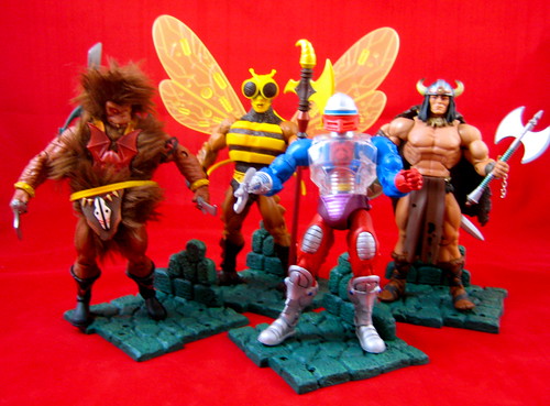
I was putting together my review of Mattel’s Masters of the Universe Classics Buzz-Off and Vikor, when I realised that I had written but never posted a review of the previous two releases, Roboto and Grizzlor. Oops! In some cases I’d just move on, but I had to go back and look at the first two, and one of them is currently my favourite MOTUC figure! Also, my original pics for these two were more dodgy than my usual dodgy pics, so it was a good excuse to have a redo. So, get ready for a mega-MOTUC Catch-up!

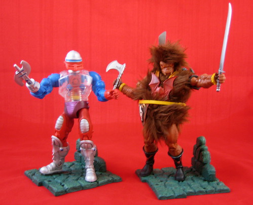
Way back in November came Roboto. This is a bit of a “meh” MOTUC figure for me. Many of the characters that are coming out in this line go beyond my MOTOC knowledge, and that’s not an issue for me, as I like many of the styles and choices in the line and really love the figures of some characters I didn’t previously know (see Grizzlor below). The issue here is that Roboto is quite outside the normal aesthetic of the line, and as I have no connection with him, I’m not that wild about him. The transparent pieces are definitely a very cool design. This just isn’t a figure that’s going to do more in my MOTUC display than hang around in the background and wish he had friends.

I love the snap-on tools element of the MOTUC figures, and Roboto has extra pieces / hands that fit in nicely into the attachments on his back. This design element is a real bonus for someone like me who isn’t overly interested in accessories and doesn’t have a great storage system for them.

Grizzlor is one of those MOTUC characters that I only have vague recollection of from the vintage years, but he’s a novelty in the line because he’s, well... cute and fuzzy. In a line that can seem same-ish at times due to the reused buck and design elements, Grizzlor is a welcome change. He’s also a toy with personality. When I was taking photos of him, there was an angle where his fur was hanging over his face in such a funny way, that I just fell in love with the guy. Until Ram-Man comes along, Grizzlor is my MOTUC star.

I had a swag of toys to unpack the day I opened Grizzlor, and thus unlisted the help of the AFB-ettes. (Or, as we sometimes call them in our household, “anti-helpers”. As such, I didn’t personally open this fuzzy guy, and thus he was presented to me with his belt unbuckled, and I really can’t work out how to reattach it. Thankfully due to all the fur and fuzz it isn’t noticeable. He still comes with a fun range of accessories. I especially love his machete style sword!

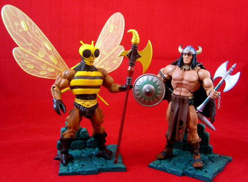
Buzz-Off is a memorable character from the original line, and one that I, like many others, have been greatly looking forward to seeing the Four Horsemen version of. It was a bit of a wait, but well worth it, as this figure has turned out brilliantly. There is some serious sculpting work here, from the small detail of Buzz-Off’s torso and face to his headsculpt with removable helmet. He has articulated pincers for hands which just hold his staff. He has some interesting ridges that run down the side of this legs to three-toed street.

All of that positive comment comes before I’ve even started discussing Buzz-Off’s wings. These are beautifully designed. They are translucent with a detailed pattern in them, and swing to a number of different angles, great for posing in fight or flight modes. They are quite high when fully extended, in fact too high for the shelf in my Billy Bookcase I have my MOTUC figures displayed in to be displayed fully extended. Truly an excellent piece.

Vikor was the first MOTUC subscription figure that I have considered off-loading, but that was before I received him. I think he’s a bit of a stretch for inclusion in the line, but he’s a good looking figure, and I’ve decided he’s worth keeping on that merit alone. I found removing him from the package quite a challenge, as his cape was well and truly stuck in the plastic insert and the attachment didn’t appear terribly secure, which made me afraid of breaking it. In the end, I used scissors to free him to be sure.

Vikor is another good example of what can be done with the basic MOTUC buck simply through accessories. There’s no particularly special new sculpting on the buck itself, but his helmet, cape and accessories work together to make quite a distinct and different figure. Considering my apathy towards the character, I’m quite surprised by how much I actually like Vikor now that he’s on my shelf. He’s not going to star in any of my displays, but he fits better in my mind than Roboto.

So that moves me a bit closer to being caught up on MOTUC stuff – good thing too, since my February items just arrived today!

You can see more pics on Facebook, discuss this at the AFB Forum, and comment on this post to enter the March AFB Comment of the Month Contest!

Until next time!

Tuesday, March 01, 2011

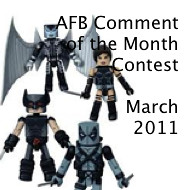
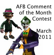
March Madness! The AFB Comment Contest for March 2011!

First off, thanks to everyone who commented on last month’s blog posts! Congratulations to dj jimenez for being our randomly selected winner! My random number generator at Random.org has yet to choose repeat winner in all the time the contest has been going! Very clever! Once we hear from dj (you can contact me through the AFB Forum - send a message to "Andy"), his choice of either the DC Universe Classics Wave 16 Robin figure from Mattel or the Yellow Eternal Dalek figure from Character Options will be on the way when available from Mike’s Comics N’ Stuff.

Now to March’s Contest: on offer are two great prizes, either the DC Direct Arkham Asylum Series 1 Joker & Scarface Two-Pack figures from DC Direct or the Uncanny X-Force Minimates set from Diamond Select - either of which would be a great prize!

A few bits and pieces:

  • every genuine comment on a post from the calendar month will be eligible to receive the prize. I’m going to stick to my own time zone and call it at 23:59:59 Australian Eastern Standard Time – best to comment often and comment early!

  • if my super scientific randomizer comment selector system chooses an Anonymous comment, I’ll skip it and go again – you need to leave a name, a link, your AFB Forum username or email addy so that I can contact you if you are the winner. Blogger comments allows you to do this, as long as your profile is not set to private – check your settings.

  • you will be given a choice of one of the two figures on offer from the month’s contest – figures will be in their original packaging.

  • figures will be sent by first class mail within the US (Mike is sending them, remember) and first class international to any overseas winner. An overseas winner can elect to chip in for Priority Mail or Insurance, but otherwise we can’t take any responsibility for a parcel that doesn’t arrive – after all this is coming out of AFB’s not dreadfully deep pockets!

Once again, thanks to Mike for making this all possible for us, and here’s to another happy month of commenting!

Until next time!


Wednesday, February 23, 2011

Pick of the Crop: Sideshow's Psylocke Comiquette

Having had a long break from comics from about 1989 – 2003, one of the most startling changes I struggled to comprehend upon my return was what had happened to the X-men’s Psylocke as a character. When I stopped reading X-Men she was a mild mannered, conservatively dressed telepath just finding her feet, and it took me awhile to realise that the scantily clad ninja lady on the team when I started reading again was actually the same character. It’s taken me a while to grasp her evolution as a character and appreciate her place in the Marvel Universe.

Regardless of that, she looks pretty amazing when cast in plastic or resin, and there has been no shortage of Psylocke collectibles lately. She’s been transformed for the Bishoujo line by Kotobukiya, cast as a Full Size Museum statue by Bowen Designs, and produced as the latest in Sideshow’s Mark Brooks Comiquette series, which is the piece I’m reviewing here today.

The Bowen and Sideshow Psylocke pieces were both solicited around the same time last year, and I was torn as to which I would buy. I ended up ordering the Sideshow piece, and then while waiting for it to be released got the Bowen piece for a good price as well. It’s not my favourite Bowen statue, mainly because the face is a bit small and nondescript, but it is a part of completing a Bowen X-Men display and serves a purpose there.

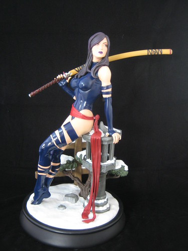
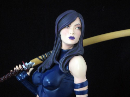
The Sideshow Psylocke, however, is an absolute beauty. She sits on an Asian-themed base, slightly reclined, with a knowing and confident expression on her face. One of the things that I think the larger scale and elaborate bases of Sideshow’s Comiquettes affords to the sculptor is the ability to really convey personality or humour in their work. I really like this pose and base, as it conveys something about the background of the character and is very attractive but not overly suggestive. The concept and design is a real winner for me.

One thing that I don’t think the Bowen Psylocke statue got quite right was the colour choices, which were a bit dark and murky. There are different purples and blues at work in her hair and costume, and the choices made here are excellent and supported by very good paint apps.

The sculpt work here is brilliant. I simply love Psylocke’s head – the way her hair has been sculpted and her facial expression. I don’t know that this will please fans who favour her Jim Lee – style look, but I love it. The lines of her body, the balance of her pose and the intricate work on the base demonstrates amazing skill.

As with many of the Sideshow Comiquettes, there are a number of parts to unpack and assemble to get Psylocke together, and a couple of things to watch out for. There are some small bonsai trees that are separate pieces, and one of mine came out of the box with a crack in it. This was easy to repair even with my limited gluing skills, but I could have broken it completely apart while removing it from the box if I hadn’t noticed it right away. The other thing that is a bit challenging is the attachment of Psylocke’s sash, which is designed to cascade over the pillars she’s sitting on. It’s a clever look, but the attachment from the sash to her belt is a bit loose on mine, and it kept coming out every time I moved the statue. As I imagine the sash would break pretty easily if it fell on a hard surface, I’ve had to secure it by putting a very small piece of Blu-Tac into the hole in her belt. These are not major issues, just a couple of things worth being mindful of when unpacking this piece.

Now that Psylocke has been released, Sideshow seems to be moving on to a new series of Women of Marvel Comiquettes, the first of which is the upcoming Sue Storm / Invisible Girl Comiquette designed by Jelena Djurdjevic. It will be interesting to see how these pieces stand up against the Hughes and Brooks incarnations of the line. The larger scale of these Comiquettes makes them something I can’t be completist about, as I simply won’t have room to store or display them all!

You can see more pics of this and my other Sideshow Comiquettes at Facebook, discuss this at the AFB Forum, and comment on this post to enter the February AFB Comment of the Month Contest.

Until next time!

Tuesday, February 22, 2011

That '70s Custom: The New AFB Custom Contest!


The Seventies were a pretty amazing time. People danced to disco. They wore bell-bottoms. They watched "What's Happenin'?'" on television. No, really.

Meanwhile, superheroes and villains donned some of the most cosmic gear ever seen! Who could forget Luke Cage's iconic tiara, or Angar the Screamer's amazing hippie gear, for instance?

What better way to celebrate those time than a custom contest? Our inaugural AFB Forum Contest, "What the Buck?!?", was a great success, and our custom team are excited to make "That '70s Custom" even better!

This contest is open to everyone - whether you are currently a member of the AFB Forum or not, whether you have ever attempted a custom before or not. The more the merrier!

You can check out the full list of rules and requirements here at the AFB Forum. Please check it out, and spread the word!

Entries close on the 30th of April! We're looking forward to a great comp!

Monday, February 21, 2011

AFB Presents Starman's Toys I Grew Up With: DinoZaurs!

Following on from last month's successful look at Blastaar, our friend Starman is ready to bring us the next installment of his AFB Guest Feature, "Toys I Grew Up With." The thing that makes this feature so interesting to me is the wide range of lines Stars has collected over the years, and I think you'll agree! Over to you, Stars!

Hey guys,

Up today for your viewing pleasure is a little line from Bandai called DinoZaurs.

This line was imported from Japan in 2000 where they are known as Dinozone.

The line consisted of transforming dinosaurs, dragons and pre-historic mammals.

The offerings from this line consist of: Basics, Deluxes and boxed figures.

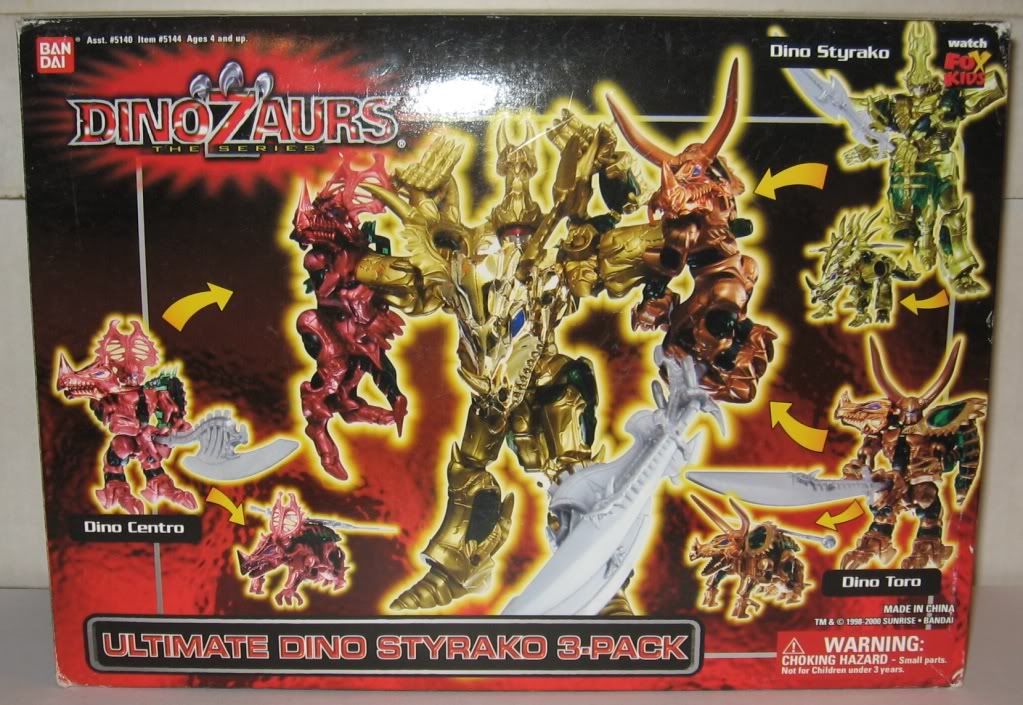
There were 5 boxed figures and also 5 boxed sets consisting of 2 or more figures. Out of the boxed sets, only the Ultimate Dino Styrako 3-Pack contained all new figures. The rest consisted of one or 2 re-issued figures and one or 2 new ones.

All of the Dragozaurs were repaints of the Dino Knights with the exception of Gigano Dragon, Drago Wing and Drago Draconus.

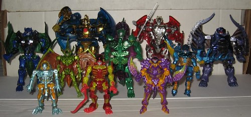
Here are all the figures in the line:

Dino Knights

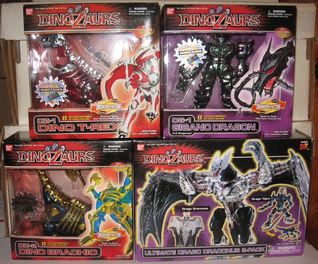
DZ-1 Dino T-Rex "Dino Tyranno" (boxed)
DZ-2 Dino Brachio (boxed)
DZ-3 Dino Stego
DZ-4 Dino Sabre
DZ-5 Dino Ptera
DZ-6 Dino Tricera
DZ-7 Dino Mammoth

Dragozaurs

DG-1 Gigano Dragon (boxed)
DG-2 Drago Tyran (boxed)
DG-3 Drago Brachio (boxed)
DG-4 Drago Stegus
DG-5 Drago Tigra
DG-6 Drago Dactyl
DG-7 Drago Ceratops
DG-8 Drago Elephas

3-Packs

Ultimate Dino T-Rex 3-Pack
DZ-1 Dino T-Rex
DZ-11 Dino Pachy (new)
DZ-12 Dino Arch (new)

Ultimate Dino Brachio 3-Pack
DZ-2 Dino Brachio
DZ-4 Dino Sabre
DZ-13 Dino Kenty (new)

Ultimate Dino Styrako 3-Pack
DZ-8 Dino Styrako (new)
DZ-9 Dino Toro (new)
DZ-10 Dino Centro (new)

2-Packs

Ultimate Gigano Dragon 2-Pack
DG-1 Gigano Dragon
DG-9 Drago Wing (new), also the only original mold I don't own )

Ultimate Drago Draconus
Drago Draconus "Dark Dragon" (new)
DG-5 Drago Tigra

The line also contained 5 figures that were non-transformable “action figure” versions of 5 of the Dino Knights. Each one of these had an action feature and were pretty good.

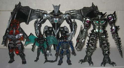
Have a look at two pics of the figures here, and then check out all the rest of my pics at the full review at the AFB Forum.


Dino Knights


Dragozaurs


Hope you enjoy 'em!

Stars

Check out the Toys I Grew Up With Board at the AFB Forum, and comment on this post to enter the February AFB Comment of the Month Contest!

Sunday, February 20, 2011

Diamond Selects Magneto and Deadpool for the Marvel Select Treatment

Diamond has picked up the pace in the output for their Marvel Select line in recent times, and it's been a very welcome development. There was quite a delay in releases there for awhile, and now they're coming thick and fast! Diamond has been following a steady pattern of releasing X-Men related characters, and I'm looking at two of them tonight - Magneto and Deadpool.

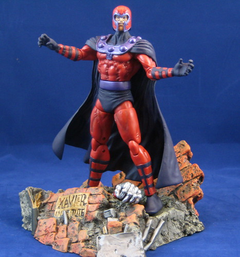
Magneto has pretty much gone right to the top of the list of my all-time favourite Marvel Select figures. The outstretched hands and his facial expression really capture the character, and the design and sculpt is top-notch. The basic MS male buck has some issues - the men can appear a bit barrel-chested, and the legs popped on to the (ick) ball-jointed hips makes the thighs seem huge. I think Magneto's cape helps distract from these issues. It's beautifully done. Paint is perfectly applied, and the different but complimentary shades of purple really lift the piece.

My enthusiasm for this figure isn't just about the figure itself, however. One thing that I'm not always wild about in terms of the Marvel Select figures is the bases, as they can be rather bland and require too much room to be of use in my cramped display space. Magneto's base is an example of the best Diamond can do when they really put their minds to it. Magneto is standing on what appears to be the remains of Xavier's School for the Gifted, complete with Colossus' hand popping out of the rubble. This is a sensational piece that reflects the individual character and can be displayed without taking up a terrible amount of room. It goes right up there with Iron Man's burst of take-off cloud and Ghost Rider's flaming base with demon-ish hands emerging from it as the best of the smaller MS bases to date. It also lifts the Marvel Select Magneto from a great figure to a brilliant figure in my book.

There is an unmasked "variant" for Magneto which I haven't purchased. I wonder how well these unmasked variants sell - seems to me I've paid enough for the extra head to be included! I don't mind paying a bit more for these when they have a great base like Magneto does, but to pay double just for an unmasked version? No dice.

Deadpool is a character that came about during my long hiatus from comics, and I've never quite connected with him. I don't know much about his backstory, but I do know that he has an interesting physicality, and that's something that the standard MS buck isn't quite up to capturing. This is still a great looking figure, and the paint and sculpting work are excellent. I'm not a fan of over-articulated figures, but this character makes me think that if Diamond is going to produce a wider range of characters in this line, it needs a slightly more lithe and articulated buck for characters like Deadpool - this figure isn't up to the types of crouching or leaping poses I'd like to use. Perhaps something could be done here in the same way that Mattel has introduced a more articulated buck into the DC Universe Classics line for characters like Blue Beetle III.

Deadpool comes with one of those boring Marvel Select bases I mentioned earlier - something that doesn't reflect anything specific about the character and that would take up too much room on the shelf to display - straight into storage for this one!

These are both very solid figures, but Diamond's effort with Magneto captures the character in a way I just don't feel is achieved with Deadpool. Both figures are great to have and will be happily displayed, but Magneto's getting pride of place for sure!

You can see more pics at Facebook, discuss this at the AFB Forum, and comment on this post to enter the February AFB Comment of the Month Contest!

Until next time!
Tuesday, February 15, 2011

DCUC Wave 18 Revealed - Thoughts?

So, now that we know that Mattel's DC Universe Classics Wave 18 is the much-rumoured Super Friends-themed wave (many thanks to Matty's Facebook Page for the photos), what's your reaction?

If you happen to have been under a rock for the last 48 hours, Wave 18 has been confirmed as:

  • Samurai

  • Black Vulcan

  • El Dorado

  • Toyman

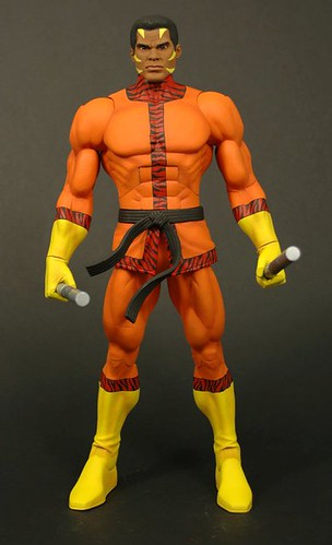
  • Bronze Tiger (swappable heads)

  • Captain Boomerang (Brightest Day Digger Harkness)

  • Apache Chief Collect and Connect

The presence of Super Powers and Super Friends characters in DCUC has been a bone of contention with many since the early days of the line, so in a sense it's a relief to see these announced, since it really was inevitable.

While I would have preferred the line to stay more strictly centred around comic-based characters, I am one of those who does have a strong childhood love of the Super Friends gang, and now that they're being made, I'm certainly looking forward to having them.

As for the figures themselves? I have to say that the Four Horsemen have pretty much nailed the whole Super Friends crew. I'm not entirely sold on El Dorado's headsculpt, but that's the only reservation I have at this point. I'm interested in elements of Samurai and Apache Chief's costumes which seem to be cloth-based, and will be keen to see if this survives into the retail versions. I like the inclusion of some power bolt constructs for Black Vulcan (the guy's gotta have something to compensate for short pants, right?) and would love to see more of this in the future.

It's worked well for Mattel's Green Lanterns, and there are many other characters whose powers and abilities could be demonstrated in similar ways. Toyman also looks to be a winner with some fun accessories to boot.

I have no idea what Bronze Tiger and Captain Boomerang have to go with the rest of their wave-mates, but they are welcome additions to the line. The lack of a Classic Captain Boomerang variant is a stunning omission - to me he has to be one of the most glaringly overlooked characters from DC's Bronze Age yet to be made in 6" scale by any company. The Brightest Day version of Digger looks to have turned out much better than I might have expected, however. Bronze Tiger is the real excitement here, especially with the inclusion of an extra unmasked head.

After the drastically different structures for Waves 17 and 18, I am very keen to see if Wave 19 will continue the trend of themed waves or go back to the more eclectic structure we grew accustomed to, and which I much prefer. I'm also not liking waves without female characters when they are already so under-represented in the line. Most importantly, will we see the completion of teams like the Metal Men and Doom Patrol? Questions I'm keen for answers to.

So what about you? Do the recent changes in DCUC waves excite or concern you? Are you buying Wave 18? Comment and let me know!

You can see pics of all of Wave 18 at Matty's Facebook page, and comment on this post to enter the February AFB Comment of the Month Contest!

Until next time!

Sunday, February 13, 2011

DC Direct Clowns around with Harley Quinn!

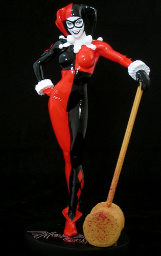
I've been greatly enjoying DC Direct's Cover Girls of the DC Universe Statue Series, based on artwork by Adam Hughes, but I didn't pre-order the Harley Quinn installment of the series because she isn't a character that I'm particularly interested in. When I saw the statue in person, however, there was a little but important detail that made me decide to buy it. What was it? Read on..

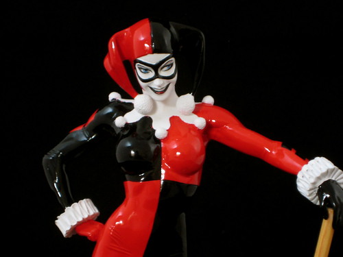
This series continues to impress me, and I'm obviously not the only one - I noticed that my Harley was one of 8000, which is an incredible edition size for statues these days! One of the things I really appreciate in this line is that the translations from Hughes' art to the sculpt have been pretty much flawless, and Harley Quinn is no exception. I love the pose that Hughes chose for this, and it's been brilliantly executed in this piece. Hughes certainly knows how to draw the female form, and Jack Mathew's sculpt has conveyed that skill beautifully into three-dimensional form!

A good sculptor can give different elements of a design different senses of texture and weight, and Mathews has accomplished that here very expertly. The tassels at the ends of Harley's jester hat and cowl look like tassels - you have to touch them to see they're sculpted. Another example of this is the great wooden look that Harley's mallet has.

Even the best design and sculpt can be let down by a poor paint job, but there's no danger of that here. I tend to prefer matte finishes to pieces, but the shinier, reflective paint used here really suit Harley's outfit and accentuate its design of contrasting colours. It also helps her matte--painted mallet appear to be made of different materials. My statue has a flawless paint job.

Last but not least, what was it that made me decide to buy this beautiful piece when I saw it? It may sound a but macabre, but it was the blood spatter on the head and lower handle of Harley's mallet. It wasn't the gruesome aspect of this that appealed to me, but rather the humorous element that turned this statue from a good looking piece to something I decided I wanted to have on my shelf. Adam Hughes is very skilled at instilling a little "wink" to the viewer in his designs, and it's been very well done here!
I've passed on the Batgirl statue which was next up after Harley as it just doesn't gel with the rest of the series for me, but am very much looking forward to the future of the series, with Poison Ivy out shortly. Stay tuned for more Cover Girls of the DCU reviews!

You can see more pics of this and all of my other Cover Girls of the DCU Statues at Facebook, discuss this at the AFB Forum and comment on this post to enter the February AFB Comment of the Month Contest!

Until next time!

At long last - DCUC Wave 14!

I think any collector who's being honest will admit that they have a touch of the obsessive compulsives. It's what makes us good at what we do, right? Anyway, that's the rationale I'm using for not being able to bring myself to review DC Universe Classics Wave 15, which I've had for a little while now, until all of the Wal-Mart exclusive Wave 14 was in my possession, and I could keep the reviews in the proper order. I'm happy to say that my Wave 14 set is now complete, and the reviews can flow!

Some time ago now I caved in and bought an Ultra-Humanite I found on eBay. I won't spend time on him again here as there's no difference between that version and the one I assembled from the Wave 14 Collect and Connect parts. Still a great figure!

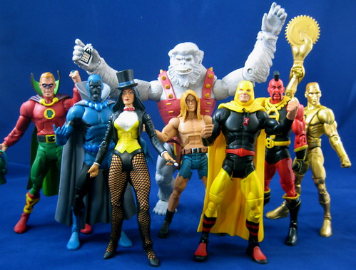
Kamandi's presence in this wave is a real testament to how amazing DCUC can be when it's at it's best. While I still long after a Jack Kirby-styled Last Boy on Earth, the DCUC version will work as a very effective placeholder in the iterim. He has a gun and a belt with working holster. His cut-off shorts are sculpted on, which helps add to the richness of what could be a very bland figure. The main improvement I would have liked to have seen with this figure would be a facial expression that was less blank

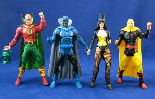
Zatanna easily goes to the head of the class of DCUC females, sitting right alongside Black Canary and Hawkgirl on my list of favourites. She has the advantage of a jacket with bulkier sleeves which work around the stick thin arms of the standard DCUC buck, my main bug bear with these figures. She also has a very well executed face sculpt and paint, a relief after disappointments in recent waves, like cross-eyed Donna Troy. I do wish that someone could up with a solution to the chunky seams that have to seem to go on the backs of mini-fishnets, but that's not an issue unique to DCUC by any means.

Zatanna's hat and wand are excellent - she can hold or wear the hat and the wand fits snugly in her hand. The only niggle I've had with mine is a bit of trouble finding a natural pose that can be used without a stand, but I suspect that's partly my issue, as inventive posing of figures isn't a skill of mine.

Alan Scott and Hourman are welcome additions to the small but growing Golden Age and JSA presence in the DCUC line. Alan Scott has the open-mouthed facial expression which I find a bit distracting, but is a still a great figure. I'm pleased to see him made in his younger version and hope this carries over to Jay Garrick as well when he is eventually made. His sleeves are nicely sculpted and the straps of his boots are also sculpted on, not just painted. Mine has the smallest of wrinkles in the chest emblem. Otherwise, the paint is perfect - great colour choices.

Hourman doesn't have an open-mouthed expression, but he also doesn't have any shading on the inside of his cowl, which means his head and face doesn't appear quite as one might be used to. It is otherwise an excellent figure, although Hourman came out of the package particularly twisted due to Mattel's action-style posing, and it took a while to get him sorted out and make him easy to pose. There's an easy MA variant to be made out of this figure, and I hope we see it soon.

Tyr is present here due to his Super Powers connection, and while that's an annoyance for some, it's a huge winner for me, since in the comic book world he's a Legion of Superheroes villain. There appear to be two shades of red paint out there, and I'm happy to have randomly received the non-tomato red version. Skin tones aside, this is an excellent sculpt. I think it's funny, though, that Alan Scott gets the angry, open-mouthed face, while a villain like Tyr gets a more neutral visage.

The one slight disappointment for me in the wave is Gold. I'm trilled to see the Metal Men finally being made in a 6" scale, but this one misses the mark for me due to the bland face that captures none of the character in the way that Wave 12's Iron and the upcoming Mercury from Wave 16 do so successfully. There's something odd about the face on Gold that I just can't put my finger on - he reminds me a bit of the little boy robot from A.I. - just... off. Sculpt is great in all other respects, and his accessories are just brilliant, but I couldn't give Gold full marks because the face bothers me that much.

The winner of the wave for me, though, is Obsidian (Todd Rice on the packaging) even with the open-mouthed expression. I'm a very big fan of the original Infinity Inc. characters (where are my collected reprints, DC??), and am keen to see more appear in the line. Some figures are exciting to have simply because it's the first time a character has appeared in a certain form, but in this case it's much more than that. This figure is truly like having the character walk out of a comic book. It's not just well designed, but perfectly painted with great colour choices as well. Obsidian's currently the apple of my DCUC eye!

There are a couple of things that impress me as I look at this wave. First is the detail in things like each caped character having a cape of a different length and design. This is a great touch that shows care and quality. The second is how well the standard male buck serves different characters and looks. I do wish the female buck was a match in quality!

The best thing about this wave, however, is that despite it's Wal-mart exclusiveness I didn't have resort to scalper prices for any of these thanks to the generosity of fellow collectors at the AFB Forum and Critical Mess who made it their mission to see that international friends got these at reasonable cost. Many thanks to the great collecting community out there!

You can see more pics at Facebook, discuss this at the AFB Forum, and comment on this post to enter the February AFB Comment of the Month Contest.

Until next time!

Monday, February 07, 2011

AFB Custom Spotlight: Gladiator!

One of the things I have most enjoyed since I started interacting with other collectors online is seeing the amazing custom work so many people produce. I was not blessed with the skills to do such amazing things - in fact I wasn't blessed with good fine motor skills at all! Instead of trying to customise my own figures, I've bee very contest to see the great results other people have been able to achieve, and have been very fortunate to be able to get many much-wanted characters done as commissions over the years, as this blog can attest!
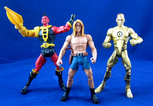
Over at the AFB Forum, we have a very clever group of customisers who post their work in our customs board, called "The Originals". As a new monthly feature at AFB, I'm going to spotlight one of these great pieces of work. There's a bit of twist though: I'm going to choose the custom this month, but from here on in it will be the responsibility of the chosen customiser to choose the next custom (not their own work) to be featured.

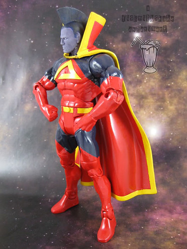
For the first run of this new feature, I thought it was fitting to choose the winner of our first custom contest, which was an amazing Gladiator figure completed by fishmilkshake to win the "What the Buck?!?" contest held last year. I've invited fishmilkshake to share his inspiration, recipe and process with you! Over to you, FMS!

fishmilkshake writes:

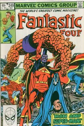
A long time fave of mine, Gladiator was always high on my list of "must do" Marvel characters when I started customising. When I got started, the first thing I noticed were the inconsistencies in his appearance. Not just his costume, but even his skin colour. For a long time I even thought his mohawk was head gear and not actual hair. So anyway, I decided to base my figure on one of my favourite comics, John Byrne's "Fantastic Four #249". (Cover is upper left)


Recipe:
Buck: DCUC - Ocean pyjama Aquaman body and Red Tornado head and cape.

Paint: Games Workshop "Skull White" aerosol undercoat, Tamiya 'Italian Red', Gunge Sangyo Blue & Yellow, Games Workshop 'Liche Purple', custom colour for the mohawk.

Build:

- I had to sand off the 'arrow' logo from Red Tornado's head.

- The mohawk was made from two sheets of plasticard glued together then shaped to fit. I used Tamiya modelling putty to fill the gaps where it joins the head. I used a scalpel to score lines in the mohawk to give the appearance of hair strands

- The pointed ears are made from 'green stuff' and then shaped.

- The belt buckle is a small Batlogo from a DCD figure.

- Gold cord from the fodder bin.

The chest logo started off as a waterslide transfer and quickly became a disaster. I ended up using some vinyl and glued it in place.

I made a specific effort to keep the gloss of the paint used for the costume as a contrast to the matte colour used for his skin. The face is a basecoat of a Games Workshop colour, with 3 shades of drybrushing, each with a bit more white. The effect is to try and separate the high and low areas.

The cape was the biggest nightmare. The rubber they're made from doesn't take the paint application as well as the plastic figure. I had to use some Testors 'Dullcote' to try and seal the paint on the cape.

The sharp lines where colours meet are achieved by masking off areas with Tamiya "low tack" tape.

------------

Many thanks to fishmilkshake for taking the time to put together that great description for us. I am sure you'll agree with me that this is truly a great piece.

It's now up to FMS to select the custom from the AFB Forum that will be featured in next month's Custom Spotlight!

Check out "The Originals" Custom board here, discuss this post at the AFB Forum, and comment on this post to enter the February AFB Comment of the Month Contest!

Until next time!

Saturday, February 05, 2011

DC Direct lives on: FLASHPOINT figures teased

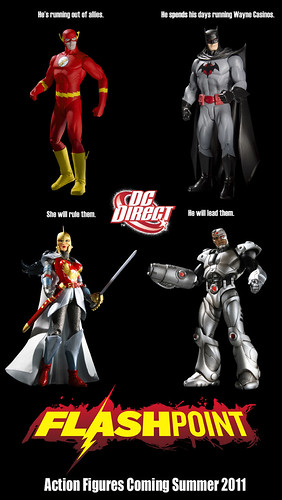
When DC's last round of solicitations didn't include any action figures, many of us were wondering what the future held for DC Direct. This speculation was added to by news that Georg Brewer appears to no longer be at the helm of the company - based on reports of changes to his Linkedin profile.

Concerns about DCD's impending end seem to have been allayed by the release of a preview of a series of figures based on DC's upcoming FLASHPOINT event at the DC Blog. Since this isn't a common method of premiering new DC Direct products, one could certainly be forgiven for thinking this is a response to internet speculation of DCD's future. No word of who's in charge, but it seems that there is a plan for more DC Direct products in the "new" DC. While not everything the company puts out is to my liking, this is still good news in my view.

As for the FLASHPOINT figures themselves, whatever you might think of these particular toys (I for one am certainly hoping for Aquaman should a second wave happen), I think we have to give DCD full marks for great improvements in having merchandise related to a specific event coming in a timely manner in relation to the event itself. This is a darn sight better than the 52 wave of figures that were quite good in themselves but came out well after the event. DCD has done a brilliant job of capitalising on BLACKEST NIGHT, but even its BRIGHTEST DAY lines are coming out after the steam behind the event has weakened. The timing for these toys seems perfect.

All up - this is good news in my book. The more DC based toys and statues, the better as far as I'm concerned. I'd just like to find out who's running the shop now so that we can have a word about scale. And ankle articulation. And...

Have an opinion? Is the news that DC Direct seems to be alive and kicking good or bad? Comment here and enter the February AFB Comment Contest!

Until next time!

Tuesday, February 01, 2011

Dalek Who? The AFB Comment of the Month Contest for February 2011!

First off, thanks to everyone who commented on last month’s blog posts! Congratulations to jboypacman for being our randomly selected winner! Once we hear from jboy (you can contact me through the AFB Forum - send a message to "Andy"), his choice of either the DC Universe Classics Wave 16 Creeper figure from Mattel or the Marvel Select Deadpool figure will be on the way when available from Mike’s Comics N’ Stuff.

Now to February’s Contest: on offer are two great prizes, either the DC Universe Classics Wave 16 Robin (Classic) figure from Mattel or the Yellow Eternal Dalek figure from Character Options - the first Doctor Who offering in the AFB Comment Contest! Winning either would be a great prize.

A few bits and pieces:

  • every genuine comment on a post from the calendar month will be eligible to receive the prize. I’m going to stick to my own time zone and call it at 23:59:59 Australian Eastern Standard Time – best to comment often and comment early!
  • if my super scientific randomizer comment selector system chooses an Anonymous comment, I’ll skip it and go again – you need to leave a name, a link, your AFB Forum username or email addy so that I can contact you if you are the winner. Blogger comments allows you to do this, as long as your profile is not set to private – check your settings.

  • you will be given a choice of one of the two figures on offer from the month’s contest – figures will be in their original packaging.

  • figures will be sent by first class mail within the US (Mike is sending them, remember) and first class international to any overseas winner. An overseas winner can elect to chip in for Priority Mail or Insurance, but otherwise we can’t take any responsibility for a parcel that doesn’t arrive – after all this is coming out of AFB’s not dreadfully deep pockets!

Once again, thanks to Mike for making this all possible for us, and here’s to another happy month of commenting!

Until next time!

Related Posts Plugin for WordPress, Blogger...