Google+

Monday, June 06, 2011

It's Voting Time! Help decide the "Toy Lines!" Overall Winner!

They came, they saw, and they were funny.


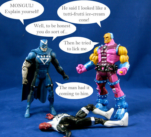
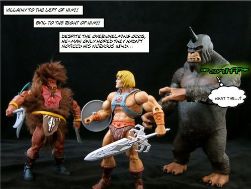
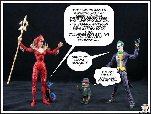
Four AFB readers rose above the rest to win their individual "Toy Lines!" Rounds, each providing the funniest captions for a picture featuring some of my very own action figures.


Now, one must rise above the rest. Three journeys will come an end, while only one "Toy Lines!" dream will survive.


(Insert other reality television jargon here. Be sure to use "journey" liberally.)


I've had my go at choosing the winners of each round - now it's your turn to choose the overall "Toy Lines" Winner!


To have your say - have a reminder look at the four Round Winners below, and the go over to the poll on the right to select your favourite! You can also use the link the poll to share the poll with others so that they can vote too.


The voting closes at 23:59 GMT+10 on 18 June 2011. The results will be hidden until voting closes.


The winner will be announced here at the blog and will receive an unopened set of Masters of the Universe Classics Eternian Palace Guards!


Here are your choices:


Round One: bubbashelby


Round Two: fishmilkshake


Round Three: NiteOwl


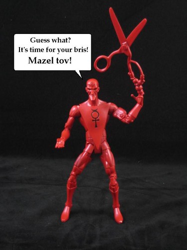
Round Four: Freak Studio


Happy voting! And of course, you can comment on this post to enter the June AFB Comment of the Month Contest!

Until next time!

Sunday, June 05, 2011

Toy Lines! Caption Contest - Round Four Winner!

First off, many thanks to everyone who entered the fourth and final round of "Toy Lines!", our new caption contest! My apologies for the extended round - real life and the busy-ness of the wrap-up of the '70s Custom Contest got the better of me!

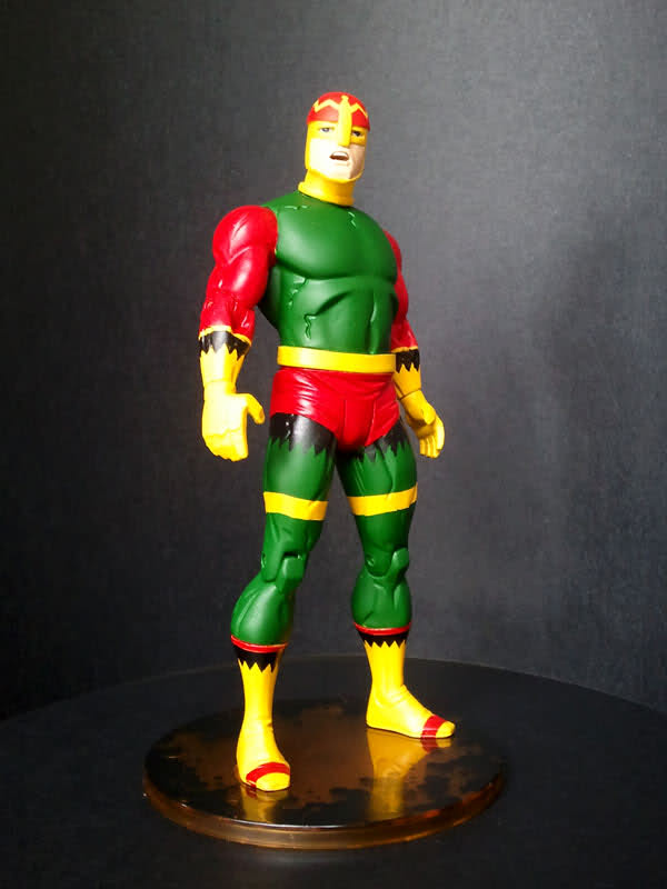
The task for Round Four was to add captions to a photo featuring DC Universe Classics Wave 16 Mercury, and while the task of captioning a solo picture may have deterred some, once again our entrants rose the challenge!

As always, I'm going with the entry that made me laugh the loudest. Congratulations to our Round Four winner, Freak Studio! Here's his hilarious entry:


Freak Studio's Round Four Winner will face off against the winners from the three previous rounds in a public vote here on the blog, with the winner receiving our prize, which is a Mattel Masters of the Universe Classics Eternian Palace Guards Two Pack,  like the one reviewed here. The prize will be an unopened version still sealed in its white mailer box.

This was the last chance to enter to win, so now it's on to choosing the Contest Winner from the four Round Winners. Tomorrow I'll have a poll up to make that process happen!

In the meantime, you can discuss Round Four's efforts at the AFB Forum, and comment on this post to enter the June AFB Comment of the Month Contest!

Until next time!

Saturday, June 04, 2011

Kotobukiya Danger Room Sessions Psylocke lights up my display!

I can think of no better way than cheering myself up from last night’s Matty sadness than to review the piece that I am going to look at tonight. The Kotobukiya Danger Room Sessions Psylocke Statue is one of my favourite recent purchases, and I haven’t stopped marvelling at her every time I pass my my display.


There have been a flurry of Psylocke statues in the last year or so, with Sideshow and Bowen both putting their FS efforts forward, and Koto has already released Psylocke in their Bishoujo line. The Sideshow and Bowen pieces were locks for me in terms of keeping collections complete, but the Bowen FS effort really isn’t a great piece in my view, so I was open to another version.


I was slow to consider Kotobukiya’s work due to some concerns about detail and paint work on their early Marvel pieces, but after loving the Fall of the Hulks Set and great experiences with the Doctor Doom and Bucky Captain America Fine Art Statues, I’m over that hurdle. Thus, when I got a good look at this piece in a local shop, I knew I’d be happy with it if I found it at the right price, and shortly thereafter I did on the often useful bay of E.


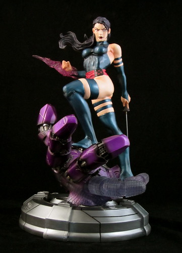
There were two things that struck me right away about this statue. The first was the dynamic pose, and the second was the determined facial expression. There is so much happening in this pose - Psylocke’s right hand has an energy blast at the ready, while her sword is held in per left. She stands astride a Sentinel hand with her left left raised at the knee. All of this detail is very nicely sculpted. I particularly like that her arm and leg bands, sleeves and boots are sculpted on as opposed to just being painted.


I love Bowen’s work, but some of the Marvel females that have been produced of late have been too blank in the facial expression department for me, and I always have been a face guy. Psylocke looks ready for battle and determined to win - and her facial expression makes the piece for me.
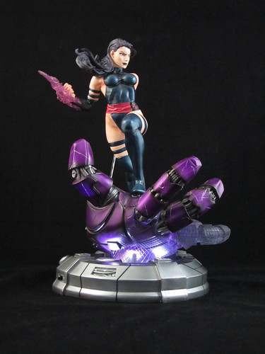

I have read some complaints in reviews about the paint work on this piece, but I’m very happy the work on mine. Of the three statues recently released of this character (excluding the anime styled Bishojo piece) this one nails the colour choices for her outfit and hair the best. There’s also a nice sheen to her uniform which gives it a different textural feel and adds depth.


As well as nailing the colour choices, the finer details on this piece have also been painted well. Painting eyes in correct alignment seems to be a dying art, but it’s been done well here, and all the details of her face are very nicely done - eyebrows, eyeliner, lips. I’m not sure what may have caused others to criticise the paint job on this piece, but I have no complaints.


All of these positives are before we even get to the base of this statue. The Danger Room Sessions series is meant to link the X-Men through its bases, with Sentinels featuring in a few, and Psylocke has a plum piece. The upturned hand makes an excellent platform for Psylocke to stand on, and it has an amazing amount of detail. The visible joints and circuitry underneath the shiny plating is a great touch. This base also has a light-up feature for extra effect. The bottom of the hand and the lower two fingers are designed to be semi-translucent to make the light go further, so it’s more effective than the lights in the Doctor Doom base. It all makes for an excellent piece.


I'm really not sure how I ended up owning so many different versions of Psylocke, seeing as she isn't one of my favourite characters. Regardless, I think this one is not only my favourite of the set, but one of my favourite pieces in my collection at present. Well done Kotobukiya!


You can see more pics at Facebook, discuss this at the AFB Forum, and you can comment on this post to enter theJune AFB Comment of the Month Contest!


Until next time!


Friday, June 03, 2011

Not Happy Matty - A Digital River Disaster


Before I get on to the first review of the month, I need to have a little rant - a Mattycollector.com related one, to be specific.


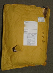
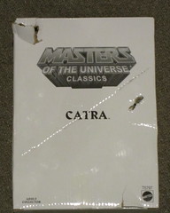
A while back Mattel started changing some shipping from boxes to shipping bags, but as an international buyer I hadn’t expected that they would be used for shipping a collector’s item all the way to Australia. As you can see from my rather sad pics of my MOTUC Catra shipment, I was terribly wrong.


This particular journey began when I made my latest trip to my post office box. (I have all my purchases sent there as parcels sent to my house tend to get left at the doorstep even though a collection card is meant to be left. I’d hate to risk something happening to my toys, right?) The clerk went out back to fetch my parcel, and when she came back there was a plastic bag wrapped around it. Never a good sign. It soon became apparent that the bag had sustained some rips and tears along the way. The clerk was most apologetic, but commented that sending something overseas in a bag like that seemed like a bit of a risk.


I waited until I got into my car to open up the bag and survey the damage. As you can see,  the white mailer box that Catra was shipped in has been fairly battered as well. A pretty disappointing result.


Now, the figure itself is fine, and as I’m not a MOC collector and I don’t collect the mailer boxes I’m not going to try to chase up a replacement, but I still think I have grounds to be unhappy about this. How on earth can Mattel really expect buyers to be happy with this kind of service? What happens when products I do want to keep in their packaging, like the Retro Superheroes line, arrive in that condition? When I fork out megabucks for my Legion of Superheroes boxed set, are they going to send that in a flimsy bag, too?


Mattel is putting out some fantastic product at the moment. It’s a great time to be a DC Universe, Masters of the Universe or Ghostbusters collector in terms of the toys being produced, but it’s just as equally a frustrating time in terms of availability and service. Things are never going to be perfect, but I do think Mattel is starting to push the friendship.


Have your own Matty story to share? You can discuss it at the AFB Forum, and you can comment on this post to enter the June AFB Comment of the Month Contest!


Until next time!


Thursday, June 02, 2011

The AFB Comment Contest for June 2011!

First off, thanks to everyone who commented on last month’s blog posts! Congratulations to Action Ranger Timmy for being our randomly selected winner! In all the time the contest has been running, this is the first time my random number generator at Random.org has chosen a repeat winner! Congrats Ryan! Once we hear from Timmy (you can can PM your choice to "Andy" at the AFB Forum), his choice of  either the Arkham Asylum Wave Two Mr Zsasz figure from DC Direct or the Movie Masters Green Lantern Naut Kei Loi Figure from Mattel will be on the way when available from Mike’s Comics N’ Stuff.

Now to April’s Contest: on offer are two great prizes, either the DCUC Wave 17 White Lantern Hal Jordan figure from Mattel or the Marvel Universe Doctor Strange Figure from Hasbro -  either of which would be a great prize!

A few bits and pieces:

  • every genuine comment on a post from the calendar month will be eligible to receive the prize. I’m going to stick to my own time zone and call it at 23:59:59 Australian Eastern Standard Time – best to comment often and comment early!
  • if my super scientific randomizer comment selector system chooses an Anonymous comment, I’ll skip it and go again – you need to leave a name, a link, your AFB Forum username or email addy so that I can contact you if you are the winner. Blogger comments allows you to do this, as long as your profile is not set to private – check your settings.
  • you will be given a choice of one of the two figures on offer from the month’s contest – figures will be in their original packaging.
  • figures will be sent by first class mail within the US (Mike is sending them, remember) and first class international to any overseas winner. An overseas winner can elect to chip in for Priority Mail or Insurance, but otherwise we can’t take any responsibility for a parcel that doesn’t arrive – after all this is coming out of AFB’s not dreadfully deep pockets!
Once again, thanks to Mike for making this all possible for us, and here’s to another happy month of commenting!

Until next time!

Tuesday, May 31, 2011

AFB Custom Spotlight: "That '70s Custom!" Contest Winners

This month's Custom Spotlight is a little bit different, as we're looking at the winner and runner-up from the most recent custom competition at the AFB Forum. We have a small but committed group of customizers who tackled our "That '70s Custom!" Contest with gusto.

Once the customs were submitted, members of the forum were given the opportunity to vote for their two favourites, giving two points to their first preference and one point to their second. Many voters commented on the quality of the field and how difficult it was to choose. You can have a look at all of the entries here at the forum, and I'm sure you'll agree.

In the end, there were two customs that rose above the pack in terms of the number of votes gained, and in fact in the end there were only three votes that separated them.

Without further ado, I am pleased to present the winner and runner up:

The "That '70s Custom!" Custom Contest Winner - "Fastbak" by dozymuppet


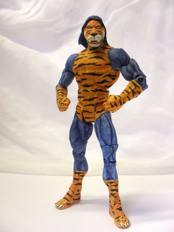
The "That '70s Custom!" Custom Contest Runner-Up - "Tiger Man" by Nite Owl


I'm sure you'll agree that these are both very deserving winners!


Are you a customizer or keen to try your hand? Check out the AFB Forum, share your work, and stay tuned for our next contest!


You can discuss this at the AFB Forum and comment on this post to enter the May AFB Comment of the Month Contest!


Until next time!

AFB Presents Starman's Toys I Grew Up With: Super Naturals!

I have been completely snowed under by work and work travel in the last week and a bit, and as such I'm going to be double posting tonight to fit in two monthly features that haven't yet appeared in May before we click over to June. It wouldn't be a proper month at AFB without a visit from our friend Starman and his "Toys I Grew Up With"! Stars is back this month to once again display his uncanny ability to dig up toy lines that we have probably never heard of before, or only remember in the deep recesses of our minds!

Over to Stars for the obscure toys lowdown!

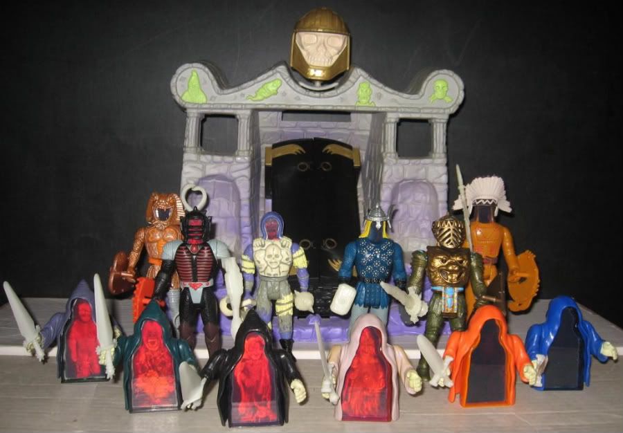
SUPER NATURALS

This is an odd little line. Made by Tonka in 1987, the feature of this line was the "new" craze...HOLOGRAMS!!!!

Basically each figure had a 2-way hologram for a head and chest. Each "hero" and "villain" had headgear and a clip-on chestpiece of some sort to cover the holograms. Then you could remove them to reveal each one's "power". They also had glow in the dark weapons and holograms on their shields.

All the small guys are Ghostlings. Four good guys and four bad guys. They were underlings or something.

Also, I have the Tomb of Doom. It has a coffin that reveals a hologram when you turn a dial on the back. It also has glow in the dark pieces and the large skull on top is a removable working flashlight.

There were also two creatures and two vehicles, none of which I own.

Anyway, onto the toys!

Here we have the villains: Snakebite, Burnheart and Skull. Then the heroes: Thunder Bolt, Lionheart and Eagle Eye. 6 of the Ghostlings are in the front, but I don't know their names. :D


You can find out more information about this odd little line by clicking here for some information. 


Thanks for reading!


Stars


------


You can discuss this at the AFB Forum and comment on this post to enter the May AFB Comment of the Month Contest!


Until next time!

Tuesday, May 24, 2011

Sideshow's Daredevil Comiquette stands above the crowd!

I don’t normally “rush” reviews - I collect and review at my own pace and am not worried about trying to get the first review out there - usually an impossibility due to my location and real life demands anyway. However, I was offered a chance for early shipping on the Sideshow Exclusive Daredevil Comiquette, and as the photos seemed to happen as I was unboxing, I decided I might as well get the review up while he’s new, so I’ve let Daredevil skip the queue for this evening’s review.

I first met Daredevil when I was given a huge box of Marvel Comics as a kid, and found the Contest of Champions Mini-Series (1982) amongst them. I particularly remember Daredevil’s role in this series, as his mission took place an in arctic snow storm, and his blindness and heightened senses assisted him in negotiating this environment and seizing the prize. It was a memorable introduction to a great character.

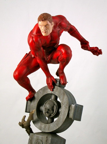
The first thing I noted when unpacking this statue was the exquisite detail in the sculpting. There is a great deal of detail in the base, which I’ll talk about in a moment, but an impressive amount of detail in Daredevil himself. Every seam, join and wrinkle of his costume is sculpted beautifully, as are both portrait options. The masked portrait is particularly impressive, with details such as ears sculpted to look just like ears under fabric - it’s captivating to look at. The pose is dynamic and very well thought out - when looking at the piece at eye level, one might think Daredevil’s head is a bit too stooped, but when you consider the height of the piece, and if, like me, you display your larger pieces on top of your cabinets, the lowered gaze makes his face clearly visible despite the tall base below him.

Daredevil sits atop a gravestone / monument which is an extensively detailed piece. It’s nice to get a break from the gargoyles so often used as bases for this type of character. The monument itself is huge, and the way that it is tilted at an odd angle and adorned with a skull create a suitably spooky feel. This is added to by a an old tree root which has wound its way around the gravestone. When I unpacked this I had visions of my Psylocke Comiquette and her cracked bonsai tree, but this isn’t as dainty, so there are no such issues here.

In addition to these details, there are three options for how the base is displayed, as the piece comes with three swappable name plates: one that is blank, one for Jack Murdock and one for Elektra. I’m going with the blank version, but these are all great option and another nice inclusion that allows collector to further individualise their display of this item.

This is the exclusive version of the Daredevil Comiquette, and it comes with an unmasked head and a swap-out left arm. The masked version’s right arm holds Daredevil’s trademark billy club, while the unmasked version holds his mask. I’m actually leaning towards displaying the exclusive version as the head is so well done, and I really like the loose mask being a part of the piece. The regular version is also excellent - I’ve noted the sculpting detail above.

The billy club is fine, but a seeming missed opportunity for a figure at this scale and price point. Daredevil’s billy club can do a great deal besides act as nunchucks, but that’s all we ever seem to get when it comes to DD toys and collectables. With Daredevil at this height, the possibility for showing the billy club in grappling hook mode with a wire cord could have been quite dynamic. Picky, but something that could have been considered. Still, this is one of the better Exclusive pieces in terms of the additional pieces and value for money.

Characters with a single coloured costume can be difficult to pull off, and red is a singularly challenging colour to deal with. Some sort of wash is required for adequate shading, but this can often end up making the red look dirty. A lack of shading is equally unappealing to look at. The balance is very well captured here, giving Daredevil the shadowy look that he needs. The work on the base is also excellent, and does a fantastic job of creating the look of different materials such as the stone and wood it is meant to represent. I’ve yet to be disappointed with a Sideshow paint job, and this is one of the best I’ve seen.

As Sideshow’s Marvel Comiquette line expands, so does the one issue that could turn some buyers off this piece, and that’s scale. Sideshow’s Comiquettes flow in different veins, and while they may not be intended to be viewed as a cohesive line in the way that Bowen’s Marvel Statue series is, it’s understandable that some collectors might want a consistent look scale-wise for their Sideshow pieces. I have to say this doesn’t bother me personally, but those that are concerned by it may feel that Daredevil himself is too small here. Indeed, the base does almost overwhelm the character here, and it could have been possible to reduce the size of the base and increase the size of the figure atop it to make him more in scale with other releases. Collectors wanting to display this as a set with the Elektra and Bullseye Comiquettes (which aren’t perfectly in scale with each other themselves) may be disappointed.

This is the first Sideshow Exclusive piece I’ve purchased that has included the exclusive print. I am still trying to get around to framing the few pieces of original art I’ve purchased, so these aren’t really drawcards for me. I have to say I was impressed, however, by both the print and its presentation. It comes in a sturdy folder which will make it easy to keep even if framing doesn’t happen. Not something that would cause me to buy an exclusive alone, but a very nice inclusion.

This piece was a Sideshow waitlist that converted. I initially hesitated on this piece due to concerns about scale, so I decided to cast my lot with the waitlist gods and see what happened. In the end, I’m very pleased to own this piece. I’m not always terribly fussed about exclusive vs. regular versions, but this is one case where I really feel the exclusive extras make the piece over all. While the scale issue is going to be a stopping point for some collectors, this works fine for me, and earns Sideshow my happy two thumbs up!

You can see more pics at Facebook, discuss this at the AFB Forum and comment on this post to enter the May AFB Comment of the Month Contest!

Until next time!

Saturday, May 21, 2011

AFB Experiences the Domino Effect, Bowen Style!

It’s back to Bowen Designs tonight, and this time I’m looking at another of their website exclusive pieces. This time around, it’s the Bowen Exclusive Domino Mini-Bust. Domino may have recently been shuffled out of the X-Force line-up in the comics, but she can still be front and center on this happy statue collector’s shelf!
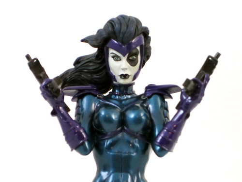

This bust is based on Domino’s early appearances, and fits quite well with the Retro Cable Mini-Bust from a couple of years back to create a bit of an original X-Force “feel”. This first appearance style is likely to be pleasing to fans of the ‘90s era of X-Folk.

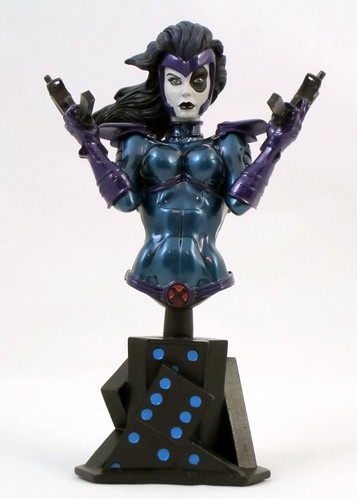
When this bust started shipping, there was a bit of web panic on a couple of forums about the angle of the statue in relation to the base, specifically that Domino was leaning too far back and to one side. This seemed to mostly be based on one reviewer’s photo, which was clearly not taken at a straight angle. In person, there is no issue. The figure is leaning slightly back, but that is because of the way she’s holding her guns, and the angle on my piece at least is perfectly straight. Crisis averted. The sculpt on this figure is in fact very tight. There is a fine amount of detail in Domino’s uniform, her weapons and her fair. The entire piece is beautifully sculpted.

This bust has one of the nicest paint jobs I’ve seen on a bust in quite awhile, due in a large part of the very nice use of metallic paint. There are two metallic blues and one purple that work very well together, and also provide an excellent contrast to Domino’s white skin, black eye and black hair. The end result is that all of the metallic colour highlights her face and makes it more striking.

The one criticism I have of this piece is an issue that has come up with a few Bowen females lately, and that’s the blank facial expression. She certainly beautiful, and the arched eyebrows help a bit in terms of giving Domino some character, but the eyes and mouth don’t give us much else to respond to. It’s a hard ask, as I am not always a fan of open-mouthed sculpts, but a bit more is needed here to really bring life to this piece. It’s beautiful to look at and I’m glad to have it, but it is just missing that little “spark”.

I always like bases that make sense for the character, and this bust excels in that department. The use of dominoes might seem a bit literal, but it’s also a clever way of creating a meaningful base for the character. The base is made up of a number of dominoes arranged at different angles, with blue dots to tie in to Domino’s uniform. All of the elements of this piece really do pull together to make quite a cohesive whole.

One of the things I love about Bowen’s Marvel output is their willingness to delve well beyond the top tier of recognisable characters. Domino’s X-Force appearances were the first time that I really came to know the character. Her interaction with Vanisher were interesting and I was sad to see the exploration of that cut short by the revamp of the book. I’d love to see her get a Full-Size Statue treatment with a modern age, X-Force look!

You can see more pics at Facebook, discuss this at the AFB Forum and comment on this post to enter the May AFB Comment of the Month Contest!

Until next time!

Wednesday, May 18, 2011

Supergirl breaks into DC Direct's Cover Girls line

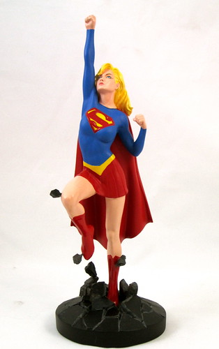
DC Direct’s statue output had remained strong and steady despite the wavering fortunes of its action figure line. Its Cover Girls of the DC Universe full sized statue line, based on designs by Adam Hughes, has been its flagship statue line in recent times, and shows no sign of dying down any time soon. Tonight I’m looking at the DC Direct Cover Girls of the DC Universe Supergirl Statue, which carries the banner of this great line very capably.

For starters, this statue gets top marks from me for using a classic Supergirl look. I am really not a fan of her current bare midriff garb - frankly I think it’s rather ridiculous looking. This is more of a 70’s style Kara - longer hair than her Silver Age look, but not yet in the 80’s headband and curls. It’s a perfect choice for this piece, and I like that the series is working across multiple eras.

This is a different piece in the Cover Girls line in that it’s an action pose which depicts Supergirl in flight. It’s a nice change, and the piece is very nicely sculpted. The one thing that I feel could have improved the end result would have been a more determined or expressive look on Supergirl’s face to really emphasise the action element of the design. Hughes’ designs usually have a little spot of humour or glint in the eye, and this facial expression is a bit bland by comparison.

This Cover Girls statue has a different type of base to the others in the line. The previous pieces have had either plain black bases or black bases with the character’s name painted on it. There are different requirements for this base, as it needs to support Supergirl’s flying pose. This is accomplished by the creation of a base that is rock that Supergirl is smashing through on her path to the sky. This effect is added to by a really nice touch which is some extra small bits of rock which are connected to higher pieces of the statue. These help create a dynamic visual effect
It’s very rare that a statue’s paint job looks better in person than in the promo shots, but there is an element of that happening here. DCD’s promo photos for this piece left me a little bit unsure of the quality of paint on Supergirl’s face, but in person I’m very happy with it. After a hiccup in the paint QC department with previous release Poison Ivy, the Cover Girls line is back to its otherwise good track record in this area.

This is a great addition to the Cover Girls line. I think the action pose is a nice contrast to many of the other pieces, and it adds some height and variety to the display if you choose to group them together. I would have loved to see a more definitive facial expression to really tip this piece over into perfection.

Another thing that this majestic Supergirl statue has done is to reinforce my decision not to buy the recent Batgirl statue in this line. The humorous element to the Batgirl statue was part of the issue for me, but the cartoonish feel to the look of the piece really doesn’t fit with the rest of the line at all. I have a running bet with someone at the AFB Forum about whether or not I’ll eventually crack and pick up the Batgirl piece, and I have a feeling I’m going to win by remaining a holdout. This lovely, serious Supergirl statue seals the deal, and makes me want more than ever a Hughes-style Babs Gordon to match.

I’m now looking forward to the upcoming Hawkgirl and the recently announced Starfire and Raven pieces of this line. It’s great to see the line working out to some slightly less commonly produced characters, and I hope this is an indication of a long life to come for this great series.

You can see more pics at Facebook, discuss this at the AFB Forum and comment on this post to enter the May AFB Comment of the Month Contest!

Until next time!

Tuesday, May 17, 2011

Yellowjacket buzzes in to the Bowen fold!

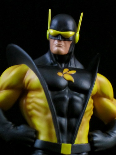
Bowen Designs’ statue output has been pretty impressive in recent times. Randy Bowen and his team are steadily working through the corners of the Marvel Universe which have yet to be covered by Bowen’s Marvel licence. Amongst the great range of characters being produced, founding Avenger Hank Pym has been getting some special attention. I’ve already reviewedBowen’s Ant-Man Full Sized Statue, and now it’s time to look at the Bowen Yellowjacket Full Sized Statue.

When I first “met” Hank Pym in the comics, he was in his Yellowjacket identity and costume and was rejoining the team in Avengers Vol 1 #211 for  a short tenure that would end badly. Yellowjacket has become synonymous with the troubled aspects of Hank’s life and personality. The Yellowjacket costume is also, in my humble opinion, one of the better superhero costumes around. One of the best Yellowjacket stories in my mind, apart from the Egghead epic back in that early run, is Avengers Forever, where a group of Avengers drawn together from different times includes both Hank as Yellowjacket in his most troubled times and an older, wiser Hank back in the Giant-Man identity.The juxtaposition of the two demonstrated how much Hank had evolved, and in some ways helped bring Hank full circle. A great story, and a fantastic Yellowjacket tale.

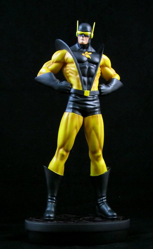
Yellowjacket may not have been able to stand tall amongst his peers, but thankfully this statue stands proud amongst my Avengers statue display. The sculpt is brilliant, not just in detail, but in the way that it manages to capture and communicate Yellowjacket’s “personality” and attitude through his stance and facial expression. The only thing I’m not 100% sold on here are his goggles, which are a little bigger and more joined together than his traditional comic book look. Definitely not a big detraction, but something that requires some getting used to.

My customising friends tell me that yellow is a difficult colour to work with, but there’s no issue with the paint work here. There is some very nice shading work with the yellow, and nice texture and depth created through the use of some different sheens. The base is also a winner - a smaller, space saving base which is always a welcome fit. This is certainly one statue where no detailed base is needed - it speaks for itself!
True Hank Pym fans will be pleased to know that Bowen has plans to address more of his costumed identities. The Giant-Man statue (a whopping 21”!) has been solicited, and the promo pics for this statue show other Giant-Man and Goliath versions (including the Clint Barton Goliath which I’d love to own!). These will all be complimented by at least two versions of Wasp that Bowen also has in the works.

If you’re a statue collector and an Avenger fan, times are good at the moment! Now we need Randy and team to get on to the last few key Avengers characters that haven’t been addressed in either bust or statue form: Mantis, Swordsman, Moondragon, Starfox and my most wanted, Captain Marvel II / Photon / Pulsar, the lovely Monica Rambeau – I’ve probably left your favourite off the list, but for me these are the “must-haves” still missing from my Avengers display.

While there are still some key characters to be covered, it’s a relatively small list in relation to the huge Avengers roster already covered.


You can see more pics at Facebook, discuss this at the AFB Forum and comment on this post to enter the May AFB Comment of the Month Contest!


Until next time!


Sunday, May 15, 2011

Nightcrawler "Bamfs" Into the Sideshow Comiquette Line

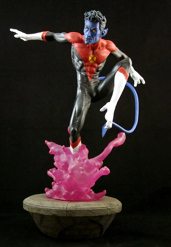
It's time to turn back to a large scale item, and tonight’s choice is a beauty. The Sideshow Nightcrawler Comiquette was an instant order for me due to my love of the X-Men’s own teleporting fuzzy elf. I had a couple of reservations about the piece from the promo shots, but these all disappeared when I saw this fantastic statue in person.
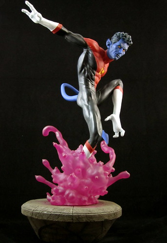
The two things I was worried about were the pose and the scale. In photos, there was something about the pose that looked a tad awkward to me, and it almost seemed as though the head was a little bit too big for the body. Thankfully it all works well and is nicely proportioned in person. The left leg is raised rather high, but a gymnast like Nightcrawler would definitely be limber enough to pull it off. It is an awkward pose when you study it, and Sideshow definitely could have come up with something a tad more graceful, but as a whole the piece still works well. The head size concerns seem to have been a trick of photography, as it works just fine on the shelf.

I don’t find it as easy to estimate the scale of a 1:5 piece as I don’t own many of them, so I was wondering how this was going to fit in with my other Sideshow Comiquettes, which are all of the female variety. Particularly, I was hoping this would work with the Rogue and Mystique Comiquettes, and it does quite well. Rogue and Mystique aren't perfectly in scale with each other, but together the three make quite a complimentary set for a X-Dysfunctional Family Diorama.

Critique of the chosen pose aside, the sculpting work on this statue is excellent. Nightcrawler’s distinctive hands and feel are perfectly constructed and his musculature is beautifully defined. His tail is long and graceful. This is all complimented by an excellent paint job all around. I’ve never had any paint concerns with Sideshow Comiquettes, and this is no exception.

The base of this statue has two components: a stone round at the bottom which is topped by a burst of what is meant to be the brimstone-smelling smoke that Nightcrawler’s teleportation produces. This version looks more like bright pink protoplasm - the smoke effect was captured better in Bowen Designs’ original Nightcrawler full-sized statue. Sideshow’s take on the effect is very visually appealing, but not terribly comic accurate. Still, it achieves the desired result of showing Kurt’s powers at work.

This wasn’t a terribly easy statue to assemble for this particular collector. The statue’s right leg doesn’t have a foot, as it’s hidden in the “bamf” cloud, and I had some trouble inserting the leg into the cloud at the correct angle. Eventually we got there. It is pretty stable despite the small circumference of the leg supporting the whole statue, but I don’t know that it would withstand a good bump. Best to abandon any ideas of dancing with this statue, methinks.

There is a swap-out portrait option with this piece, which pictures Kurt with shorter  hair and a different, fiercer face. It doesn’t look much like “my” Nightcrawler, so the decision making on which to display wasn’t a challenge. The headsculpt of the main portrait still has a serious expression, but somehow it still captures both the playful aspect of Nightcrawler’s personality and it also has his classic mop of curly hair, which is essential Kurt in my book. The short-hair version also makes the statue look a little hunched over to me due to it’s lack of height.

The Sideshow Exclusive version of this statue came with a sword to reflect Nightcrawler’s swashbuckling ways. A very nice touch, and as always it’s good to see the exclusive version coming with an extra piece and not just a print, but I don’t know that I would have displayed it, so I was happy with the regular version.

One has to be selective with Sideshow’s larger scale pieces thanks to cost and space considerations, but this piece really deserves a place in the collection. If I was on the design time I would have tried to re-toll the pose somewhat and had another look at the teleportation effect, but neither of these issues really detract from my enjoyment of the piece. While Nightcrawler takes his turn on the death merry-go-round in the comics world, I’ll be very content to have this great statue on my shelf for a regular fuzzy elf fix!

You can see more pics at Facebook, discuss this at the AFB Forum and comment on this post to enter the May AFB Comment of the Month Contest!

Until next time!

Saturday, May 14, 2011

DC Direct delivers a second dose of Poison Ivy!

Last month I had a look at DC Direct’s full sized Poison Ivy effort, but that’s not the only statue attention the Foilage Fiend-ess has had this year (you have no idea how long it took me to come up with that alliteration!). This time around, I’m looking at the DC Direct Women of the DC Universe Poison Ivy Mini-Bust.

I mentioned in my review of the Cover Girls Poison Ivy that I’ve never been all that fond of Ivy’s modern age green-skinned look. I am, however, quite a fan of Amanda Conner’s art, on which the current series of these mini-busts are based. I don’t know that I’d buy a full-sized green-skinned version, but to keep the Conner Mini-Bust series complete, I decided to pre-order this.

As it happens, this little bust has turned out to be a pleasant surprise! Conner has a very particular and recognisable style which has lent itself very well to this statue series, and Conner’s take on Poison Ivy is excellent all around and a great addition to the line.

What I really like about this mini-bust is that Conner has focused on the character’s beauty rather than her villainy. We know Poison Ivy is a baddie, so we don’t need it in neon lights in this piece. Instead, we see Ivy reveling in the use of her powers, atop a base of foliage which includes a couple of rather questioning looking mushrooms.

Jim Maddox has done an excellent job on the sculpt of this mini-bust. There is a great deal of detail in this piece, and everything from the leaf details on Ivy’s bodice to the foliage in her base to the waterlily she is holding to the sky, it’s all beautiful. I’ve long been a fan of Maddox’s work for DCD, Bowen and elsewhere, and his sculpting here certainly does not disappoint.

Unlike the Cover Girls Poison Ivy statue, which had some paint issues, this piece is spotless. The colours are well chosen, and compliment the slightly cartoon-ish edge to Conner’s design. The bright orange of her hair is a great contrast to the pale green of her skin, and the darker greens used to highlight her facial features really makes them stand out.

This isn’t a statue that can be posed at any level of a display as Ivy is looking upwards at quite an angle. I have most of my Women of the DCU Mini-Busts on a higher shelf in my display, but at that level I couldn’t see Ivy’s face at all, so I have her on a lower shelf. This isn’t really a complaint, as in many ways it’s the pose that makes the statue, but something to note for potential purchasers.

All up, for a piece I ordered purely to keep a line complete, I am surprised by how much I ended up liking a green-skinned Poison Ivy in mini-bust form. Well done to DC Direct, Amanda Conner and Jim Maddox for making it so!

You can see more pics at Facebook, discuss this at the AFB Forum and comment on this post to enter the May AFB Comment of the Month Contest!

Until next time!

Tuesday, May 10, 2011

MOTUC Madness with King Hsss and Battle Armor Skeletor!

It’s time to delve back into the wacky world of Mattel’s Masters of the Universe Classics line by looking at the next set of releases in line for review. March’s MOTUC review offerings included a subscription figure with a snaky twist, King Hsss and our first extra figure of the 2011 subscription, Battle Armor Skeletor. Both are great additions to the MOTUC Collection.

With King Hsss, Mattel proves once again what a bit of unique sculpting on a basic buck can do to make a figure look totally unique. Unfortunately, they’ve also proven that the MOTUC shoulders are obviously very easy to swap, as they’ve done it again! Thankfully this doesn’t irritate me, but I know it’s a frustration for many collectors. Hopefully all of the great extras that come with this figure are enough to help anyone over look this avoidable error. There is some very nice sculpting here with the snake-skin ridges on King Hsss’ helmet, torso, arms and legs, which is supported by an excellent paint job, making the human version of Hsss a very smart looking action figure.

King Hsss can ‘shed’ his human skin to reveal a whole mess of snakes underneath. This would have been a pretty cool ‘action feature’ back in the ‘80s, but we modern day collectors have to settle for a snake head and torso that swaps on to Hsss’ legs to make the ‘all-snakes’ version. For a pack in piece, the swappable snake head and torso for King Hsss is a pretty amazing. The mouth of the main snake head is articulated at the jaw, and the two snake “arms’ are posable through the use of bendable wire inside. It makes for a very cool looking snake dude!

A further credit to Mattel is that the inclusion of this detailed extra head and torso has not led to any skimping on other accessories. He has a red shield and an excellent staff with a snake wrapped around it that is one of my favourite MOTUC accessories to date. All this pretty much covers swapped shoulders in my book.

After I’d opened King Hsss and seen how much I liked both the humanoid and snake versions, I was pleasantly surprised to see one on offer at a LCS for a reasonable price, and decided to pick it up so that I could have both versions on display. Although there is I’m not the kind of collector who tends to swap alternate pieces around on a figure or statue, so it was worth it for me in this instance. King Hsss and the extra Snake Man get two AFB thumbs up!

One of the ‘catches’ of the all-in subscription format for 2011 is that there are four “quarterly figures” which are repaints or different versions of previously issued characters. The first of these is Battle Armor Skeletor. The charm of the original Battle Armor figures, for me anyway, was that the different armors were on a rotating bar in the middle of the figure’s chest and could each be produced by striking the armor section, showing the increasing degrees of damage.

This version comes with three separate breast plates to indicate the different degrees of damage. Like I said above, I’m not the type that’s good at keeping all of these pieces in an easy to find place and swapping them around, so these inclusions really are a bit pointless for me. Thankfully BA Skelly is a nice looking figure sculpt and paint-wise.

I don’t mind having an extra Skeletor around, as it leaves one Skelly for the ground-level display while another can ride Panthor, who will be featured in my next MOTUC review!

All up - March was a great month MOTUC-wise, and the display is looking healthier than ever with no sign of slowing down. I’d love to see the silly errors like swapped shoulders get corrected, and still hope for the day that Matty finds a faster international shipping service than the Digital River slow boat, but I’m still very much on board with this line!

You can see more pics at Facebook, discuss this at the AFB Forum and comment on this post to enter the May AFB Comment of the Month Contest!

Until next time!
Related Posts Plugin for WordPress, Blogger...